Revisiting GC content and chromosome length
Remember that example in the R tutorial? We saw that, for the human genome, GC content seems to be inversely related to chromosome length.
Let's use linear regression to estimate this relationship now. We'll do it for humans and also for a couple of other organisms.
The data can be found
here. To load
into R, right-click and choose 'copy link' and then load in R using the read_tsv() function as follows:
library( tidyverse )
data = read_tsv( "<paste your link here>" )
Print out the data frame to see what variables it holds. You should see several columns reflecting the organism, chromosome, chromosome length, and gc percent.
Use table() to see what values the organism column holds. What organisms are in there?
Plotting
Before going further let's plot the data again. We'll use ggplot for this so we can see all the organisms at once. First, I like the 'minimal' theme so let's set that now:
ggplot2::theme_set(theme_minimal( 16 ))
Now let's plot. The facet_grid() function can be used to split the plot over the different organisms:
p = (
    ggplot( data = data )
    + geom_point( aes( x = length_in_mb, y = gc_percent ))
    + facet_grid( organism ~ . )
)
print(p)
Fitting linear regression
Ok, let's estimate the relationship between the two variables (GC content and chromosome length). We'll do this by fitting a linear regession model, using the function lm().
Fitting the model is in fact really easy. We use the lm() function and give it a formula relating the outcome variable (gc_percent, i.e. the 'y axis' variable) to the predictor variables. For us, we'll just use the chromosome length_in_mb as predictor. Let's try it now:
fit = lm(
    gc_percent ~ length_in_mb,
    data  = data %>% filter( organism == 'human' )
)
Ok! The lm() function has found the 'best fitting' straight line to the data. It returns an object that can be
accessed to see what the best-fit line is.
The best way to look at the fit is to get the coefficients, that is, the estimated parameters. This can be done like this:
coefficients( summary( fit ))
Your coefficients should look something like this:
> coefficients( summary( fit ))
                Estimate  Std. Error   t value     Pr(>|t|)
(Intercept)  44.31484709 1.088899945 40.696895 3.324169e-22
length_in_mb -0.02365607 0.007746123 -3.053924 5.818152e-03
Interpreting the point estimates
Ignore the second two columns just now - in fact let's chuck them out for now:
coefficients( summary( fit ))[,1:2]
                Estimate  Std. Error
(Intercept)  44.31484709 1.088899945
length_in_mb -0.02365607 0.007746123
What you see there are the parameter estimates and their standard errors.
Essentially, lm() has fit a straight line of the form
to the data. That means it has estimated that an increase in length by 1Mb is associated with a decrease in gc percentage of 0.02%.
The longest chromosome is around 250Mb long, while the shortest is under 50Mb. So this estimate would correspond to about five percent difference in GC content between the longest and shortest chromosomes.
Look back at the plot - does this work about right?
We can visualise this by plotting the line onto the graph using geom_abline() . Let's restrict just to humans and plot again:
human_data = data %>% filter( organism == 'human' )
p = (
    ggplot( human_data )
    + geom_point( aes( x = length_in_mb, y = gc_percent ))
    + geom_abline( intercept = 44.3, slope = -0.024, col = 'red' )
)
print(p)
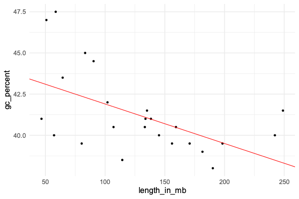
Does it look like a good fit?
The model
As you'll have noticed, the points don't lie exactly on the line. This is natural for linear regression and works as
follows. Linear regression models the outcome variable (gc_percent) as a linear function of the predictor variable
(chromosome length) plus some 'residuals'. Roughtly speaking, the model fitting process finds the line that minimises these residuals as much as possible.
To be specific, linear regression minimises the sum of squared errors - that is, it 'minimises residuals' in this specific sense.
The residuals (difference of the true gc_percent to the line) can be obtained using residuals(fit). Let's use that now to plot them:
hist( residuals(fit), xlab = "Residual" )
We could also **compare the residuals to expected residuals (if the model were true):
residual_data = tibble(
    expected = qnorm(
        1:nrow(human_data) / (nrow(human_data)+1),
        sd = sigma(fit)
    ),
    residual = sort( residuals( fit ))
)
ggplot( data = residual_data ) + geom_point( aes( x = expected, y = residual ))
This is known as a quantile-quantile plot. It plots the expected quantiles of the residual (x axis) against the observed quantiles (y axis).
:::Question
If the model fits well, you should roughtly see a diagonal line - do you? (Try adding a geom_abline() to see.)
:::
Interpreting the standard errors
In this output:
coefficients( summary( fit ))[,1:2]
                Estimate  Std. Error
(Intercept)  44.31484709 1.088899945
length_in_mb -0.02365607 0.007746123
The second column are the standard errors. What are they?
The standard errors express the uncertainty we should have in the parameter estimates. In other words, even though the line is the best fit, other lines might also be possible.
Probably the simplest way to interpret the standard errors is to convert them to confidence (or credible) intervales. This is easy. If the parameter estimate is and the standard error is , the 95% confidence interval is:
Let's plot that now. We'll take the opportunity to set up a dataframe for all three organisms:
forest_plot_data = tibble(
    organism = c( "human" ),
    beta = c( -0.02365607 ),
    se = c( 0.007746123 )
)
Let's make the forest plot like in the lecture. We can use geom_segment() to draw lines, and geom_point() to draw
the points:
p = (
    ggplot( data = forest_plot_data )
    + geom_segment(
        aes(
            x = beta - 1.96 * se,
            xend = beta + 1.96 * se,
            y = organism,
            yend = organism
        )
    )
    + geom_point(
        aes(
            x = beta,
            y = organism
        ),
        size = 2
    )
)
print(p)
Hmm... to make this better, let's fix the x axis scale and add a line at 'no association'. And while we're at it, let's make it into a re-useable function as well so we can use it later:
draw_forest_plot = function(
    forest_plot_data,
    xlim = c( -0.05, 0.02 )
) {
    forest_plot_data$lower = forest_plot_data$beta - 1.96 * forest_plot_data$se
    forest_plot_data$upper = forest_plot_data$beta + 1.96 * forest_plot_data$se
    print( forest_plot_data )
    p = (
        ggplot( data = forest_plot_data )
        + geom_segment(
            aes(
                x = lower,
                xend = upper,
                y = organism,
                yend = organism
            )
        )
        + geom_point(
            aes(
                x = beta,
                y = organism
            ),
            size = 2
        )
        + xlab( "Slope of association" )
        + xlim( xlim[1], xlim[2] )
        + geom_vline( xintercept = 0, linetype = 2 )
        + theme( axis.title.y = element_text( angle = 0, vjust = 0.5 ))
    )
    return(p)
}
draw_forest_plot( forest_plot_data )

Cool!
This plot shows us - as long as we believe the model - that:
- The point estimate of the association is -0.024, over to the left of the 'no association' line
- The 95% confidence interval is also over to the left of the 'no association' line. In other words (if we believe the model) there is evidence that the slope really is nonzero.
How much evidence is there? This is usually summed up by the P-value, which is in the fourth column of those coeffiencts:
coefficients(summary(fit))
The value is . A direct way to interpret this is that, we can be about 99.4% percent sure the slope is less than zero.
This is the bayesian interpretation of these results. In effect, 99.4% of the posterior mass lies to the left of the line.
There's another common way to interpret this as well. It says that - if we were somehow to repeat our experiment over and over, and if there were no true association, then we would still estimate an associatino this strong about 0.58% of the time - pretty unlikely. This is the frequentist interpretation and is a common way to hear people talk about P-values.
However - the frequentist interpretation makes no sense here because, of course, we can't 'repeat the experiment' since there is only one human species! But, as long as we are happy to rely on this model, it's still perfectly valid to interpet this as a 99.4% chance the effect is negative.
All the organisms together
Let's repeat this for the other two organism. We'll use a loop to estimate the association in each organism, and add the data as rows to the forest plot:
forest_plot_data = tibble()
for( what in c( "human", "chimpanzee", "mouse" )) {
    fit = lm(
        gc_percent ~ length_in_mb,
        data  = data %>% filter( organism == what )
    )
    coeffs = coefficients( summary( fit ))
    beta = coeffs['length_in_mb', 'Estimate']
    se = coeffs['length_in_mb', 'Std. Error']
    forest_plot_data = bind_rows(
        forest_plot_data,
        tibble(
            organism = what,
            beta = beta,
            se = se
        )
    )
}
Look at the forest_plot_data data frame and make sure it has estimates for all three populations. And let's plot them:
draw_forest_plot( forest_plot_data )
How do you interpret this plot?
Why is it called a 'forest plot'? Apparently it's because it shows a 'forest' of lines - as described in this paper. But the term only came into use in the 1990s.