Fitting a logistic regression
Let's get started by fitting a logistic regression model. Logistic regression is used to test for association with binary outcome variables (such as disease status) - or more generally with categorical outcomes. It's one of the basic building blocks, for example, of many genome-wide association study analyses, so it is worth learning how to interpret it.
Getting the data
The data for this practical can be found at this link.
Right-click and press 'copy link'.
Now start a new R session and load the data in like this:
library(tidyverse)
data = read_tsv( <paste your link here> )
If the above link doesn't work for any reason, try the link on Canvas.
Or try this version. (To get the URL, click 'Raw' and then copy the URL.)
What's in the data?
The data contains genotype calls for the genetic variant rs8176719 (and rs8176746), measured in a set of severe malaria cases and population controls from several African countries. These variants lie in the ABO gene and together encode the most common ABO blood group types.
In particular, rs8176719 is the main variant that determines O blood group status. It represents a one base-pair deletion that causes a frameshift and early termination of transcription. If you wish, you can read more about ABO and the O blood group mutation here.
If you want to see what the genetic effect of these variants is, you can also look it up in the UCSC genome browser and/or the Ensembl genome browser. For example you should see that rs8176719 is a frameshift variant within ABO gene. (Which exon is it in?). Chromosomes with the deletion allele (like the GRCh38 reference sequence) produce a malformed enzyme that prevents synthesis of A or B antigens (they cause a loss of glycosyltransferase activity).
(Of course, humans have two copies so if the sample is heterozygous then it's quite possible the other copy does express A or B.)
The data were collected by seperate case-control studies operating in each country and were genotyped by MalariaGEN. They were described in this paper.
Before starting, explore the data (e.g. using View(), table() and so on) and make sure you know what is in there. You should
see:
Information on the sample identifier and sex, and ethnicity
The
statuscolumn, which indicates if the sample was collected as a disease case (i.e. came into hospital with severe symptoms of malaria) or a population control.A column with the rs8176719 genotypes (and one with the rs8176746 genotypes.)
And some columns marked
PC_1-PC_5.
What countries are represented in the data?
In each country, how many samples are cases and how many controls?
Is O blood group associated with malaria susceptibility?
A and B antigens are bound to the surface of red cells and tend to stick to things - it's plausible malaria parasites might exploit this. Let's therefore use logistic regression to test to see if O blood group is associated with malaria status. Logistic regression is similar to fitting a linear regression (as we did earlier but works for a binary outcome variable, such as the 'severe malaria' status in this data.
To get started let's create a new variable indicating 'O' blood group status:
# Set to missing first, in case any rs8176719 genotypes are missing
data$o_bld_group = NA
data$o_bld_group[ data$rs8176719 == '-/-' ] = 1
data$o_bld_group[ data$rs8176719 == '-/C' ] = 0
data$o_bld_group[ data$rs8176719 == 'C/C' ] = 0
What is the frequency of O blood group in this sample, in each population?
In case you are stuck, try the following hints and solutions.
- Hint 1
- Hint 2
- Table solution
- Dplyr hint
- Dplyr solution
One way to do this is using the table() function. You can then use the results to compute the frequencies.
Another way is to build a pipeline using dplyr.
For example, this builds a table of counts:
table( data$country, data$o_bld_group )
To compute frequencies, you would then need to capture the results to compute frequencies, like this:
counts = table( data$country, data$o_bld_group )
frequencies = counts[,2] / (counts[,1] + counts[,2])
Another, longer (but cooler) way is to build a 'pipeline' using dplyr. For example you can:
- use
filter()to remove rows where theo_bld_groupvariable is missing - use
group_by()to group by country - use
summarise()to count the number of o blood group individuals, and the total, for example like this:
... %>% summarise( total = n(), o = sum( o_bld_group ))
- and use
mutate()to add the frequency,
%>% mutate( o_frequency = o/total )
Can you do it?
(
    data
    %>% filter( !is.na( o_bld_group ))
    %>% group_by( country )
    %>% summarise(
        total = n(),
        o = sum( o_bld_group )
    )
    %>% mutate( o_frequency = o / total )
)
# A tibble: 5 × 4
  country  total     o o_frequency
  <chr>    <int> <dbl>       <dbl>
1 Cameroon  1182   586       0.496
2 Gambia    5027  2152       0.428
3 Ghana      694   280       0.403
4 Kenya     3054  1546       0.506
5 Tanzania   769   350       0.455
However you do this you should see that blood group O is at about 40-50% frequency in these African populations.
Running the regression
For best results let's also make sure our status variable is coded the right way round (with "CONTROL" as the baseline):
data$status = factor( data$status, levels = c( "CONTROL", "CASE" ))
Fitting a logistic regression model is now very in R - we use the glm() function:
fit = glm(
    status ~ o_bld_group,
    data = data,
    family = "binomial"  # needed to specify logistic regression
)
This command says: fit a logistic regression model of severe malaria status modelled in terms of o blood group status, using the given dataframe. The 'family' argument is there to tell glm that the outcome variable is a binary (0/1) indicator, as glm can fit more general models as well.
Note. You can compare this to how we fit a linear model previously.
Congratulations! You've just fit a logistic regression model.
Interpreting the regression output
The best way to inspect the results of glm() is using the summary() command to get the fitted coefficients:
coefficients = summary(fit)$coefficients
print( coefficients )
You should see something like this:
> print( coefficients )
              Estimate Std. Error   z value    Pr(>|z|)
(Intercept)  0.1489326 0.02630689  5.661354 1.50183e-08
o_bld_group -0.3342393 0.03889801 -8.592709 8.49425e-18
Let's take a moment to parse this result to see what it says.
The parameter estimate
First, in the 'Estimate' column you see the fitted values of the parameters. There are, in fact, two parameters - one for something called the 'intercept', which we'll call , and one for O blood group itself, which we'll call .
The parameters are in fact expressed on the log odds scale. Specifically:
is the estimated baseline log-odds of disease. (This is the log-odds of disease if you don't carry blood group O).
is the estimated change in log-odds associated with blood group O versus non-O blood group.
The modelled log-odds of being a case is therefore (for non-O blood group samples) and for O blood group samples.
(Note: the log-odds is just a transform of the probability through the logit function:
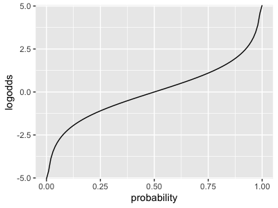
It maps probabilities (x axis) onto the whole real line (y axis), with 50% probability being mapped to a log-odds of zero.) Smaller log-odds correspond to smaller probabilities and vice versa.
Which of these statements do you agree with:
- O blood group is associated with lower chance of having severe malaria, relative to A/B blood group.
- O blood group is associated with higher chance of having severe malaria, relative to A/B blood group.
- O blood group is protective against severe malaria.
- We can't tell if O blood group is protective or confers risk against severe malaria.
Logistic vs. linear regression
In the previous tutorial we fit a linear regression model to a continuous outcome variable and a predictor variable - namely = % GC content, and = chromosome length. The plot looked like this:
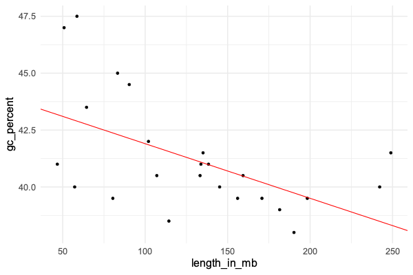
The linear regression model was:
In other words - we modelled has normally distributed, but with a mean that depended on .
The parameter estimates were interpreted as:
- was the estimated baseline value of , also known as the intercept.
- was the estimated change in for a unit increase in .
That is, we estimated that GC content drops by about 0.024% for each megabase increase in chromosome length.
In logistic regression, just like linear regression, we again model the probability that takes particular values based on the linear predictor . THere are two differences. First, instead of using a normal distribution, we use this to directly model the probability that . And secondly we work on the log-odds scale instead.
The full formula for logistic regression is therefore:
This is why the parameter estimates are interpreted on the log-odds scale, as described above, instead of the linear scale.
If you know the O blood group status of a sample in the study, you can use this to work out the modelled probability that they are a severe malaria case.
The function that transforms back from log-odds space to probability space is called the logistic function - it looks like this:
or in R:
logistic <- function(x) {
    exp(x) / (1+exp(x))
}
Can you plot the logistic function now over a range around zero? It should look something like this:
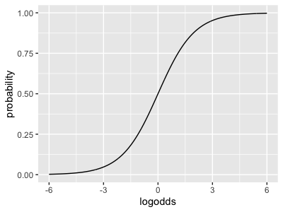
Note how it maps the whole real line (x axis, log-odds space) back to the unit interval (y axis, probability space).
Use this function to answer the following questions:
In our fitted model, what is the estimated probability that a non-O blood group individual has severe malaria in this sample? Hint: apply the logistic function to the baseline parameter estimate .)
What is the estimated probability that a O blood group individual has severe malaria in this sample? Hint: apply the logistic function to quantity .)
Caution. The probabilities in this model can not be interpreted as absolute population risks. This is because the sample is a case-control sample in which cases are over-sampled.
Hopefully you can see how the logistic model is similar to linear regression (it has the same linear predictor), but also different in how the outcome is modelled.
Logistic regression vs a 2x2 table
In fact this parameter estimate is just another way to do what you can do in a 2x2 table example. To see this, try making a table of the genotypes and outcomes:
table( data$status, data$o_bld_group )
           0    1
CONTROL 2690 2684
CASE    3122 2230
Let's think of this matrix as and compute the sample odds ratio:
If you work this out for the above table you get:
odds_ratio = (2690*2230) / (3122*2684)
Compute this sample odds ratio now, and compare it to the exponential of the parameter estimate:
exp( -0.3342393 )
What do you notice?
A key fact is that for an unadjusted regression like this (with no other variables in), the parameter estimate from logistic regression is just the logarithm of the odds ratio computed from a 2x2 table.
To fully interpret this estimate, there's a final piece of the puzzle.
In this study, disease cases hvae been over-sampled (about half of the study samples are severe malaria cases, even though severe malaria is much rarer in the population).
So to fully interpretable, imagine what is going on in the whole population, rather than the study now. Let's suppose that disease cases come along at some frequency (for individuals with non-O blood group) and (for individuals with O blood group). The simplest way to measure association in the population is using the relative risk:
Key fact. In a case-control study, if the controls are 'unselected' (i.e. just taken as members of the general population), the study odds ratio is an estimate of the population relative risk. The reason is that the above can be re-written using Bayes rule in terms of genotype frequencies in cases and population controls:
The four terms there can be estimated by taking a sample of cases and population controls, and measuring their genotypes.
Thus, even though the baseline parameter doesn't reflect the population risk of disease, the odds ratio reflects the relative risk in the population.
In our case if the relative risk is about 0.7 - we could say O blood group is associated with about 30% reduction in risk of severe malaria.
Plotting 95% intervals
Look back at the regression output now:
> summary(fit)$coefficients
              Estimate Std. Error   z value    Pr(>|z|)
(Intercept)  0.1489326 0.02630689  5.661354 1.50183e-08
o_bld_group -0.3342393 0.03889801 -8.592709 8.49425e-18
Let's use it to plot a 95% confidence or credible interval using ggplot. For this we need a data frame:
plot_data = tibble(
    population = "all",
    beta_hat = -0.3342393,
    se = 0.03889801
)
As usual it's useful to write a re-useable function here. We'll make it add the confidence interval bounds and then plot. (By now you should know the magic number here, that a 95% confidence interval goes out 1.96 standard errors from the estimate):
forest_plot <- function(
    forest_plot_data,
    xlim = c( -0.6, 0.1 )
) {
    forest_plot_data$lower = forest_plot_data$beta_hat - 1.96 * forest_plot_data$se
    forest_plot_data$upper = forest_plot_data$beta_hat + 1.96 * forest_plot_data$se
    (
        ggplot(
            data = forest_plot_data
        )
        + geom_segment(
            mapping = aes(
                x = lower,
                xend = upper,
                y = population,
                yend = population
            )
        )
        + geom_point(
            aes( x = beta_hat, y = population ),
            size = 4
        )
        + xlab( "Parameter estimate and confidence interval")
        + xlim( xlim )
        + geom_vline( xintercept = 0, linetype = 2 )
        + theme_minimal( 16 )
    )
}

forest_plot( plot_data )

This plot is on the log-odds scale. What does it look like on the odds scale (hint: try the plot after exponentiating the estimate, lower and upper. Don't forget to change the x axis label! You will of course have to change the x axis limits - something like 0.5 - 1 should work.)
Note 2. For extra kudos, transform to the odds scale as above, but then add scale_x_log10() to draw on a log scale again.
- Hint
- Solution
Click on the 'Solution' tab above if you want to see a solution.
forest_plot <- function(
    forest_plot_data,
    xlim = c( 0.5, 1.1 )
) {
    forest_plot_data$lower = forest_plot_data$beta_hat - 1.96 * forest_plot_data$se
    forest_plot_data$upper = forest_plot_data$beta_hat + 1.96 * forest_plot_data$se
    (
        ggplot(
            data = forest_plot_data
        )
        + geom_segment(
            mapping = aes(
                x = exp(lower),
                xend = exp(upper),
                y = population,
                yend = population
            )
        )
        + geom_point(
            aes( x = exp(beta_hat), y = population ),
            size = 4
        )
        + xlab( "Odds ratio and 95% confidence interval")
        + scale_x_log10( limits = xlim )
        + geom_vline( xintercept = 1, linetype = 2, lwd = 2 )
        + theme_minimal( 16 )
    )
}

forest_plot( plot_data )
In this module we are using the terms 'confidence interval' and 'credible interval' essentially interchangeably.
The term 'credible interval' is associated with the bayesian interpretation of this process, in which the estimate and interval provide a summary of our belief about the parameter estimate, having seen the data. (That is, a summary of the posterior distribution, in bayesian-speak). About 95% of the mass of the posterior is in this interval. This is the way we've presented it in lectures.
The formal definition of 'confidence interval' is more complicated (and probably not particularly helpful) - to understand it you have to imagine conceptually replicating this experiment many times over and counting the proportion of many times this process of going out 1.96 standard errors includes the 'true' parameter value in the interval - it should be about 95%.
The p-value and z score
Finally let's interpret the last two additional columns - the z score and the p-value. These in fact add no new information:
- The z-score is just the effect estimate divided by the standard error (you can check this for yourself). It says "how many standard errors away from zero is the estimate"?
- The p-value is another another measure of the same thing. It is the z-score transformed through the normal distribution cumulative distribution function (and multiplied by two, to capture both tails of the distribution):
You can confirm this for yourself in R by computing it directly:
# compute the p-value by hand:
pnorm( -0.3342393 / 0.03889801 ) * 2
You should see a value identical to the one output by the regression output.
The P-value is usually interpreted as saying "how likely would we be to see an estimate as strong as "by chance" - i.e. purely due to sampling noise - if there were no true association?"
In our case the P-value is , so this association very unlikely purely due to chance.
Looking across populations
If O blood group is really protective, we'd expect the effect to be reasonably consistent across different subsets of our data - say across countries.
Let's assess that now by looking in different countries via a loop:
forest_plot_data = tibble()
populations = unique( data$country )

for( population in populations ) {
    fit = glm(
        status ~ o_bld_group,
        family = "binomial",
        data = data %>% filter( country == population )
    )
    coeffs = summary(fit)$coefficients
    forest_plot_data = bind_rows(
        forest_plot_data,
        tibble(
            population = population,
            beta_hat = coeffs['o_bld_group',1],
            se = coeffs['o_bld_group',2],
            p = coeffs['o_bld_group',4]
        )
    )
}

forest_plot( forest_plot_data )
How do you interpret this plot?