Some useful probability distributions
In this section we will explore two useful probability distributions using R.
It's good to get used to visualising these in R. But if you prefer you can also use the interactive distribution zoo site to explore these distributions.
For this part of CM4, we are focussed on the concepts. You don't need to know all the mathematical details of these distributions, nor do you need to know all the R-specific details below. On the other hand, you should have a sense of what they are used to represent and why we might be interested in them, their shape and how the parameters work.
The Normal distribution
The normal distribution, also known as the gaussian distribution, is commonly used to handle variables that might be sums of lots of other things.
For example, we might imagine that the expression of a gene depends on lots of factors that determine expression levels, all of which add up to the eventual expression level. Or we might imagine that a phenotype (like height, for example) is determined by lots of genetic and environmental factors all adding up. It turns out that variable that are sums of lots of small things like this tend to be normal.
A famous demonstration of this is the so-called 'Galton board' which you can see here:

The result of adding up all those random jumps to the left and right is... a normal distribution.
Pick a mean value (start somewhere between and ) and a variance (which must be positive - for example, is a good starting choice). Then plot the density of the normal distribution over the continuous range .
The normal distribution density in R is given by the dnorm() function.
For example, you could plot it by creating a grid of values to plot at:
x = seq( from = -20, to = 20, by = 0.001 )
and choosing a mean and variance parameter:
mu = 5
variance = 2
Then use the dnorm() function to plot:
plot(
    x,
    dnorm(x, mean = mu, sd = sqrt( variance )),
    type = 'l',
    lwd = 2,
    xlab = "x",
    ylab = "Normal distribution density",
    xlim = c( -20, 20 ),
    ylim = c( 0, 0.4 ),
    bty = 'n'
)
grid()
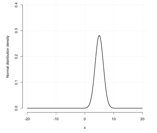
Note. As I've done above, it is best to set sensible xlim and ylim values.
How does the distribution differ as you vary the mean and the variance?
For reference, here is the formula for the normal distribution density:
It's not as complicated as it looks - the first bit is just the normalising constant (it doesn't depend on and is just there to make the distribution sum to . The second part is more or less just a quadratic formula depending on the squared distance of to the mean . (You don't need to know these details for the exam.)
Binomial distribution
The binomial distribution answers the following important question:
Suppose a particular allele is at frequency in a population of interest. If we sample chromosomes and genotype them, how many will carry the allele?
Pick a number of samples n (start between 5 and 20) and a probability or frequency (start between 0.1 and 0.9).
Then plot the binomial distribution over the range of integers .
For example, you could pick parameters like this:
n = 20
p = 0.1
and use dbinom() to plot it
x = 0:n
binom = dbinom( x, size = n, prob = p )
names(binom) = x
barplot(binom)
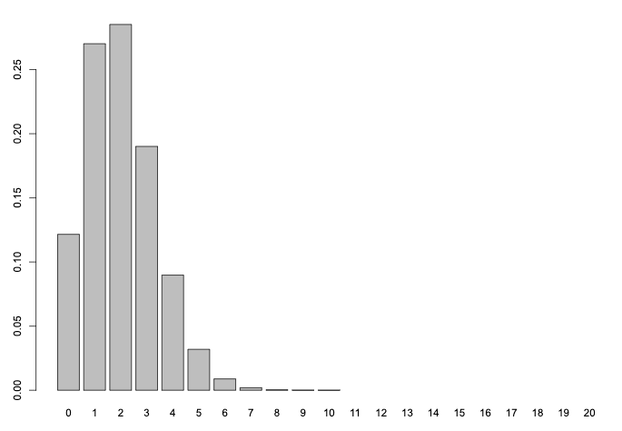
Question How does the shape of the binomial differ as you vary and ?
Note. The plot above for and says that - if the true frequency was and we sampled chromosomes, we'd be most likely to find that carry the allele - but it could be as high as, say, .
On the other hand - we'd be very unlikely to find as many as alleles. This can be computed using the corresponding pbinom() function:
pbinom(
    q = 10,
    size = n,
    prob = p,
    lower.tail = F # mass under `dbinom()` under the right-hand tail
)