Fitting a logistic regression
Let's get started by fitting a logistic regression model. Logistic regression is used to test for association with binary outcome variables (such as disease status) - or more generally with categorical outcomes. It's one of the basic building blocks, for example, of many genome-wide association study analyses, so it is worth learning how to interpret it.
Getting the data
Start a new R session and load the data in like this:
library(tidyverse)
data = read_tsv( "https://www.chg.ox.ac.uk/bioinformatics/training/msc_gm/2024/data/o_bld_group_data.tsv" )
If the above link doesn't work for any reason, try the this version. (To load this, click 'Raw', copy the URL, and read into R as above.)
What's in the data?
The data contains genotype calls for the genetic variant rs8176719 (and rs8176746), measured in a set of severe malaria cases and population controls from several African countries. These variants lie in the ABO gene and together encode the most common ABO blood group types.
In particular, rs8176719 is the main variant that determines O blood group status. It represents a one base-pair deletion that causes a frameshift and early termination of transcription. If you wish, you can read more about ABO and the O blood group mutation here.
If you want to see what the genetic effect of these variants is, you can also look it up in the UCSC genome browser and/or the Ensembl genome browser. For example you should see that rs8176719 is a frameshift variant within ABO gene. (Which exon is it in?). Chromosomes with the deletion allele (like the GRCh38 reference sequence) produce a malformed enzyme that prevents synthesis of A or B antigens (they cause a loss of glycosyltransferase activity).
(Of course, humans have two copies so if the sample is heterozygous then it's quite possible the other copy does express A or B.)
The data were collected by seperate case-control studies operating in each country and were genotyped by MalariaGEN. They were described in this paper.
Before starting, explore the data (e.g. using View(), table() and so on) and make sure you know what is in there. You should
see:
Information on the sample identifier and sex, and ethnicity
The
statuscolumn, which indicates if the sample was collected as a disease case (i.e. came into hospital with severe symptoms of malaria) or a population control.A column with the rs8176719 genotypes (and one with the rs8176746 genotypes.)
And some columns marked
PC_1-PC_5.
We'll focus on the status and genotype columns for now.
Use table() or the data verbs to answer:
What countries are represented in the data, and what are the sample sizes?
In each country, how many samples are cases and how many controls?
Is O blood group associated with malaria susceptibility?
A and B antigens are bound to the surface of red cells and tend to stick to things - it's plausible malaria parasites might exploit this. Let's therefore use logistic regression to test to see if O blood group is associated with malaria status. Logistic regression is similar to fitting a linear regression (as we did earlier) but works for a binary outcome variable, such as the 'severe malaria' status in this data.
To get started let's create a new variable indicating 'O' blood group status:
# Set to missing first, in case any rs8176719 genotypes are missing
data$o_bld_group = NA
data$o_bld_group[ data$rs8176719 == '-/-' ] = 1
data$o_bld_group[ data$rs8176719 == '-/C' ] = 0
data$o_bld_group[ data$rs8176719 == 'C/C' ] = 0
What is the frequency of O blood group in this sample, and in each population?
- Hints and solutions
- Hint 1
- Hint 2
- Table solution
- Data verbs hint
- Data verbs solution
You can get counts of genotypes either using the table() function, or the data verbs.
You then need to use these to compute allele frequencies.
For example, this builds a table of counts:
table( data$country, data$o_bld_group )
To compute frequencies, you would then need to capture the results to compute frequencies, like this:
counts = table( data$country, data$o_bld_group )
frequencies = counts[,2] / (counts[,1] + counts[,2])
A probably nicer way to do this is via the 'data verbs'. For example you can:
- use
filter()to remove rows where theo_bld_groupvariable is missing (watch out - there are a few!) - use
group_by()to group by country - use
summarise()to count the number of o blood group individuals, and the total, for example like this:
... %>% summarise( total = n(), o = sum( o_bld_group ))
- and use
mutate()to add the frequency,
%>% mutate( o_frequency = o/total )
Can you do it?
(
    data
    %>% filter( !is.na( o_bld_group ))
    %>% group_by( country )
    %>% summarise(
        total = n(),
        o = sum( o_bld_group )
    )
    %>% mutate( o_frequency = o / total )
)
# A tibble: 5 × 4
  country  total     o o_frequency
  <chr>    <int> <dbl>       <dbl>
1 Cameroon  1182   586       0.496
2 Gambia    5027  2152       0.428
3 Ghana      694   280       0.403
4 Kenya     3054  1546       0.506
5 Tanzania   769   350       0.455
However you do this you should see that blood group O is at about 40-50% frequency in these African populations.
Running the regression
For best results let's also make sure our status variable is coded the right way round (with "CONTROL" as the baseline):
data$status = factor( data$status, levels = c( "CONTROL", "CASE" ))
Fitting a logistic regression model is now easy in R.
instead of using lm(), which we used to fit linear regression, we will use the function glm() function instead:
fit = glm(
    status ~ o_bld_group,
    data = data,
    family = "binomial"  # needed to specify logistic regression
)
Compare this with an equivalent command to fit linear
regression. In the glm() command, we also have
to specify the 'family', which tells R that we are fitting a logistic regression.
Specifically this command says: fit a logistic regression model of severe malaria status modelled in terms of O blood group status, using the given dataframe. The 'family' argument tells glm that the outcome variable is a binary (0/1) indicator, and that this should be modelled using a binomial distribution.
Congratulations! You've just fit a logistic regression model.
Interpreting the regression output
The following part of this practical have been updated compared to what we ran in class - in the hope of clarifying things a bit.
You can also compare this to the updated Part I slides 43-49 on canvas for more information.
As with lm(), the best way to inspect the results of glm() is using the summary() command to get the fitted coefficients:
coefficients = summary(fit)$coefficients
print( coefficients )
You should see something like this:
> print( coefficients )
              Estimate Std. Error   z value    Pr(>|z|)
(Intercept)  0.1489326 0.02630689  5.661354 1.50183e-08
o_bld_group -0.3342393 0.03889801 -8.592709 8.49425e-18
Let's take a moment to parse this result to see what it says.
Interpreting on the log-odds scale
In many ways this is just like linear regression. You get back parameter estimates, standard errors, and P-values.
In the 'Estimate' column you see the fitted values of the parameters. There are two parameters - one for the 'intercept', which we'll call , and one for O blood group itself, which we'll call .
The parameters are in fact expressed on the log odds scale. Specifically:
is the estimated baseline log-odds of disease. (This is the log-odds of disease if you don't carry blood group O).
is the estimated change in log-odds, or in other words the log odds ratio, associated with blood group O versus non-O blood group.
Interpretation on the odds scale
However as described in the lecture it is also useful to interpret these on the odds (and odds ratio) scale, not just on the log-odds scale.
Remember there are three scales you could think about in logistic regression:
- The log-odds scale, where the parameter estimates live.
- The odds scale, where the odds ratio estimate lives, and
- The probability scale
Each one is a function of the other. To get between them you do this:
- To get odds from log-odds , set
- To get an odds ratio from log-odds ratio , compute .
- To get probability from odds , set .
- Or to get probability directly from log-odds , set .
This last function is known as the 'logistic' function and you could write it like this in R:
logistic <- function(x) { exp(x) / (1 + exp(x))}
It looks like this:
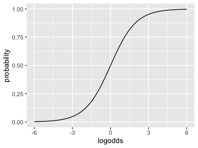
As you can see, logistic() maps log-odds space back onto probability space .
It is the inverse of the 'logodds' function shown on the lecture slides:
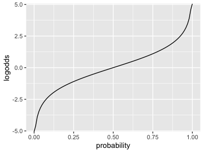
As you can see from the graphs, a log-odds of zero corresponds to 50% probability; and larger probabilities correspond to larger log-odds.
Look at the estimates again:
> print( coefficients )
              Estimate Std. Error   z value    Pr(>|z|)
(Intercept)  0.1489326 0.02630689  5.661354 1.50183e-08
o_bld_group -0.3342393 0.03889801 -8.592709 8.49425e-18
Now try to answer the following questions about non-O blood group individuals:
- What is the modelled log-odds that a non-O blood group individual is a case?
- What is the modelled odds that a non-O blood group individual is a case?
- And if you like, what is the modelled probability that a non-O blood group individual is a case?
And the same questions for O blood group individuals:
- What is the modelled log-odds that an O blood group individual is a case?
- What is the modelled odds that a O blood group individual is a case?
- ...and if you like, what is the modelled probability that a O blood group individual is a case?
And the most important question:
What is the estimated odds ratio?
What is the estimated relative risk of severe malaria associated with O blood group?
Do you think O blood group is associated with higher, or lower risk of severe malaria?
- Hints
- Hint 1
- Hint 2
- Hint 3
- Hint 4
The answers on the log-odds scale are provided to you by the fitted regression parameters.
- The baseline log-odds (for non O blood group individuals) is .
- The change in log odds associated with carrying O blood group, or log odds ratio, is .
Add them up to get the log-odds of disease, for an O blood group individual.
To get from log-odds scale to odds scale, transform the estimates using the exponential function.
- The baseline odds of disease (for non-O individuals) is .
- The odds of disease for O individuals is .
Also, the odds ratio is .
If you want to get risk estimates on the probability scale, that's possible too.
However you should remember that in this data, which comes from a case-control study, the risk estimates themselves don't really mean much about the population - they are just about the rates of cases and controls sampled in the study. (But the odds ratio is still interpretable as an estimate of relative risk.)
Nevertheless, to compute these, you can transform the odds you computed:
Or, go all the way from log-odds in one step by using the logistic function as described above.
- For example, the baseline probability of disease is - and so on.
(It doesn't make much sense to think of the odds ratio on this scale.)
In the lecture we explained the relationship between the odds ratio computed in a case-control study, and the population relative risk. What is it?
You should by now have seen that, whichever scale you look on, O blood group is associated with a reduced risk of severe malaria! It has an odds ratio of about , meaning that it's associated with a 28% reduction in risk.
Computing a confidence/credible interval
The rule to compute a confidence / credible interval is:
First compute the confidence/credible interval for on the log-odds ratio scale.
Then use exp() to convert back to the odds ratio / relative risk scale.
Compute a 95% confidence interval for the odds ratio now.
- Hints
- Solution
See if you can do this yourself. If you get stuck, see the answer on the tab above.
beta = -0.3342393
se = 0.03889801
lower = beta - 1.96 * se
upper = beta + 1.96 * se

sprintf( "   The odds ratio is: %.3f.\n", exp( beta ))
sprintf( "The 95pc interval is: %.3f - %.3f.\n", exp(lower), exp(upper) )
What is your overall interpretation of these regression results?
The forest plot
Ok that's not good enough! Let's make a forest plot of the association evidence across populations. This requires a bit of code which we can implement as follows.
First, rather than typing out our model fit loads of times, let's make a function that fits the regression for us. I'll help myself out by turning the fit parameters into a proper data frame before returning:
fit_regression <- function(
    data,
    formula = status ~ o_bld_group
) {
    library( dplyr )
    fit = glm(
        formula,
        data = data,
        family = "binomial"
    )
    parameters = summary(fit)$coeff             # up to here is the same as before
    return(
        tibble::as_tibble(parameters)           # Turn it into a data frame
        %>% mutate(
            parameter = rownames( parameters )  # Make parameter names into an actual column
        )
        %>% select(                             # Rename some columns
            parameter,
            estimate = Estimate,
            se = `Std. Error`,
            z = `z value`,
            pvalue = `Pr(>|z|)`
        )
    )
}
If you run this on the original data frame, you should see what it does - gives the same estimates again but with slightly different formatting.
Now let's use some dplyr magic to run seperately in all populations:
estimates = (
    data
    %>% group_by( country )
    %>% reframe(
        fit_regression( pick( everything()) )
    )
)
You don't have to worry about the details of this code - it is just a way to run our function across each country in the data seperately.
If you want to know how it works, the pick( everything()) bit just says to pass in the whole of the 'current data'
into our function. (Because this is after a group_by(), that means the data for the current group.)
The reframe() function in there is similar to the group by / summarise examples from the data verbs
session, but unlike summarise() allows us to return multiple rows per group. It's handy
for things like this but you don't need to know it for this module.
If you look at the output you should now see two rows per country. One row contains the details for the intercept, and the other the details for the log odds ratio () itself.
Now let's make a forest plot for the effect size parameter:
library( ggplot2 )
p = (
    ggplot(
        data = estimates %>% filter( parameter == 'o_bld_group' )
    )
    + geom_segment(
        aes(
            x = exp( estimate - 1.96 * se ),
            xend = exp( estimate + 1.96 * se ),
            y = country,
            yend = country
        ),
        colour = 'grey',
        linewidth = 1.5 # make it bigger & bolder!
    )
    + geom_point(
        aes(
            x = exp( estimate ),
            y = country,
        ),
        size = 4 # make the points bigger!
    )
    + xlim( c( 0.4, 1.2 ))
    + xlab( "Odds ratio and 95% CI" )
    + ylab( "Country" )

    # Here's some stuff to make it prettier
    + theme_minimal(16)
    + theme( axis.title.y = element_text( angle = 0, vjust = 0.5 ))
)
print(p)
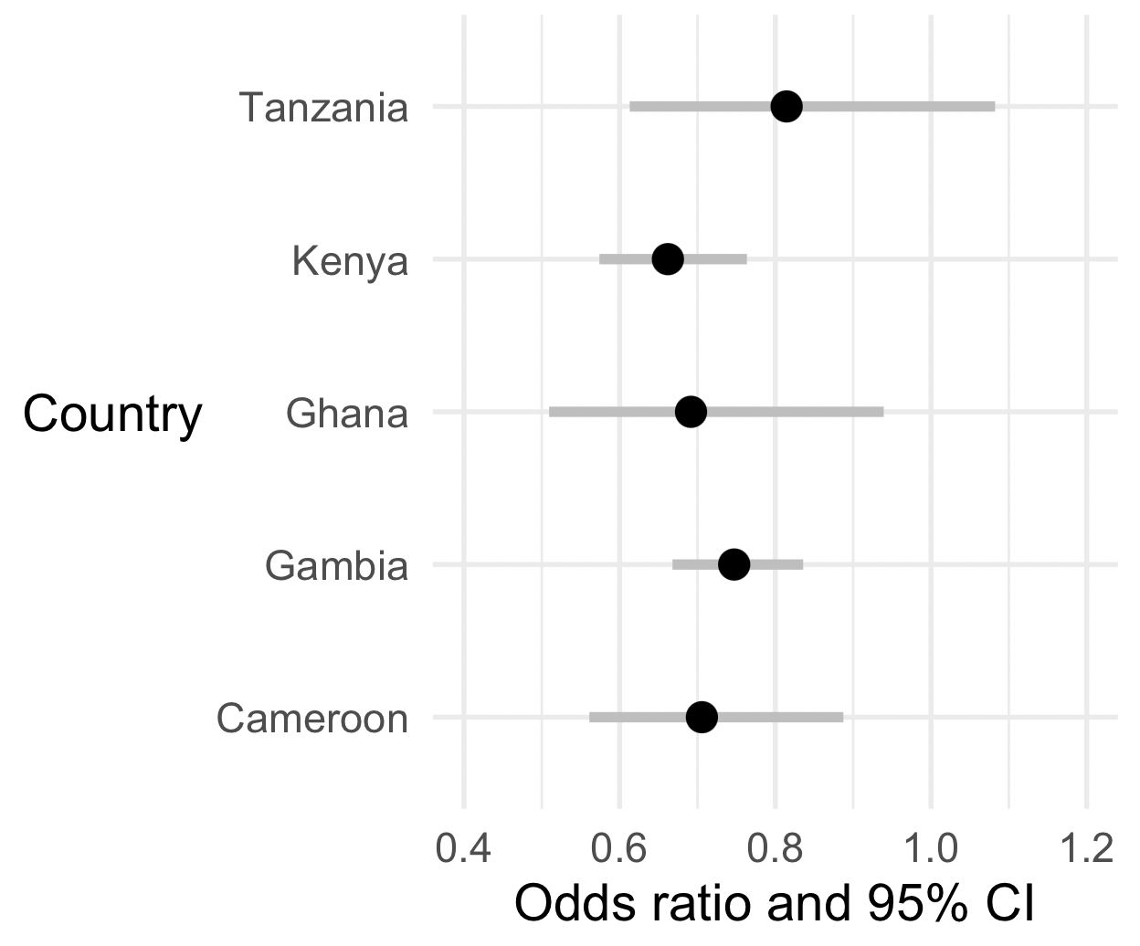
Nice? But not good enough, let's do two things to make it better!
First, let's add a vertical dashed line at (which corresponds to 'no association'):
(
    p
    + geom_vline( xintercept = 1, linewidth = 1.5, linetype = 2 )
)
The second thing is a bit more subtle. We would like the plot to be on the natural (odds ratio or relative risk) scale, as it is at the moment, because that's easiest to interpret.
But on the other hand the odds ratio scale is a bit weird for a plot! (It goes from to , and is multiplicative i.e. with corresponding to 'no association'.) So in that sense it seems better to have this plot on the log scale.
Luckily, we can have our cake and eat it by simply telling ggplot to plot on a log scale:
(
    p
    + geom_vline( xintercept = 1, linewidth = 1.5, linetype = 2 )
    + scale_x_log10( limits = c( 0.4, 1.2 ))
)
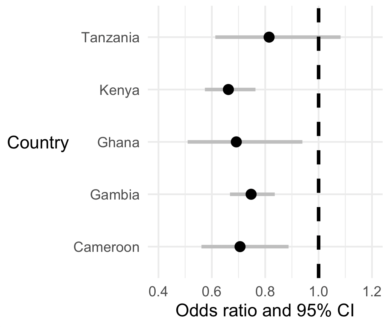
Nice!
What is your overall interpretation of these data?
Is O blood group likely associated with severe malaria across all these populations?
Congratulations - you've finished this part of the practical. Feel free to take a break for a few minutes, or read more information below if you're interested.
Other topics
Logistic vs. linear regression
In the previous tutorial we fit a linear regression model to a continuous outcome variable and a predictor variable - namely = % GC content, and = chromosome length. The plot looked like this:
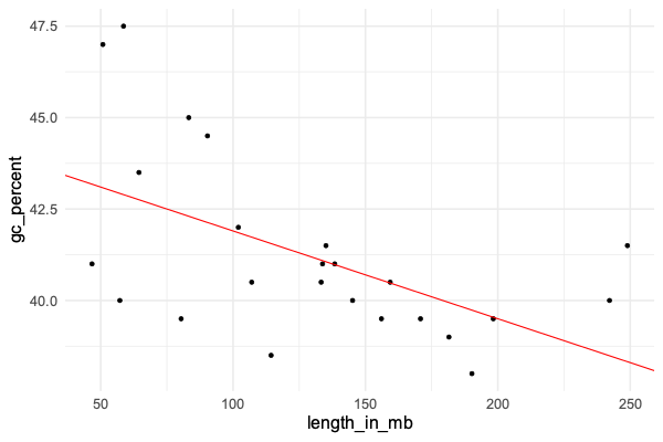
The linear regression model was:
In other words - we modelled has normally distributed, but with a mean that depended on .
The parameter estimates were interpreted as:
- was the estimated baseline value of , also known as the intercept.
- was the estimated change in for a unit increase in .
That is, we estimated that GC content drops by about 0.024% for each megabase increase in chromosome length.
The difference in logistic regression is that the linear predictor has to be interpreted on the log-odds scale - it is not on the scale of the outcome like it is in linear regression. To link to the outcome scale (e.g. disease statys), transform through the logistic function to get the modelled probability of the outcome levels.
Hopefully you can see how the logistic model is similar to linear regression (it has the same linear predictor), but also different in how the outcome is modelled.
Logistic regression vs a 2x2 table
In fact this parameter estimate is just another way to do what you can do in a 2x2 table example. To see this, try making a table of the genotypes and outcomes:
table( data$status, data$o_bld_group )
           0    1
CONTROL 2690 2684
CASE    3122 2230
Let's think of this matrix as and compute the sample odds ratio:
If you work this out for the above table you get:
odds_ratio = (2690*2230) / (3122*2684)
Compute this sample odds ratio now, and compare it to the exponential of the parameter estimate:
exp( -0.3342393 )
What do you notice?
A key fact is that for an unadjusted regression like this (with no other variables in), the parameter estimate from logistic regression is just the logarithm of the odds ratio computed from a 2x2 table.
Logistic regression and relative risk
In the above you have hopefully identified the odds ratio as an estimate of the population relative risk. That's why we can interpret it as 'O blood group is associated with about a 30% reduction in risk of severe malaria'.
We discussed this in the lectures but here is a recap.
Suppose disease cases in the population come along at some frequency (for individuals with non-O blood group) and (for individuals with O blood group). The simplest way to measure association in the population is using the relative risk:
Key fact. The key fact discussed in lectures, is that in a case-control study if the controls are 'population controls' (i.e. sampled from members of the general population), the study odds ratio is an estimate of the population relative risk. The reason is that the above can be re-written using Bayes rule in terms of genotype frequencies in cases and population controls:
The four terms there are each estimated by can be estimated by taking a sample of cases and population controls, and measuring their genotypes.
How does this correspond to the logistic regression model? It turns out the logistic regression model we fit above is equivalent to this one in a 2x2 table:
If you 'do the maths' on this table (work out the odds ratio) you'll see that the odds ratio is juse .
Thus, even though the baseline parameter doesn't reflect the population risk of disease (because of the ), the odds ratio reflects the relative risk in the population.
In our case if the relative risk is about 0.7 - we could say O blood group is associated with about 30% reduction in risk of severe malaria.