Controlling for covariates
As made clear on the previous page, association tests might be susceptible to confounding. One of the great things about regression is that it's easy to control - or at least try to control - for this, assuming we have measured relevant variables.
Controlling for population structure
In this study, there is one variable that could definitely act as a potential confounder in each country: population structure, or in other words, variation in the genetic background of different study participants. It's a potential confounder because:
- genetic background tends to vary geographically.
- consequently ancestry could easily be correlated with the phenotype, either via environmental variation or differences in rates of recruitment to the study.
- But different genetic backgrounds could definitely be associated with different frequencies of genotypes! (That's what the it means.)
Population structure is one of the classic potential confounders.
Luckily we have a couple of variables that tell us about this - a column containing the self-reported ethnicity of each participant, and also some principal components computed from genome-wide data. Let's use those to convince ourselves the association is not caused by this possible confounder.
Controlling for ethnic background
Let's focus on Kenya first, and re-fit our model across all the data, with and without ethnicity as a covariate.
kenya = data %>% filter( country == 'Kenya' )
original = glm(
    status ~ o_bld_group,
    data = kenya,
    family = "binomial"
)

adjusted = glm(
    status ~ o_bld_group + ethnicity,
    data = kenya,
    family = "binomial"
)

summary(original)$coeff
summary(adjusted)$coeff
Has including the ethnicty made a substantial difference to our estimate of the effect of O blood group?
Stop for a moment and use table() or similar to work out what ethnicities were in the data from Kenya.
Now look at the estimates that appear in the output. Which ethnicities do you see in the row names? (Note this is actually real data, but we have made up the ethnic group names to keep the originals private.)
This illustrates two key points about how glm() handles categorical variables.
First, if you add a categorical variable into the regression, it really gets treated like a series of individual variables. For example, here is has a variable ethnicity_18 which is a if the individual had that ethnicity and a if not. That's why each ethnicity gets its own output in the results.
A second point that you may have noticed, is that one ethnic group is missing from the output! (Which one?) The reason is that we already have a global baseline parameter: the 'intercept'. To avoid having two overall baseline levels, one of the ethnicities has been removed. An alternative way to solve this is to remove the overall intercept, which can be done by adding -1 to the formula like this:
adjusted2 = glm(
    status ~ o_bld_group + ethnicity - 1,
    data = kenya,
    family = "binomial"
)
summary(adjusted2)$coeff
This produces output something like this:
> summary(adjusted2)$coeff
                        Estimate Std. Error   z value     Pr(>|z|)
o_bld_group           -0.4029714 0.07834481 -5.143562 2.695779e-07
         ethnicity_17 -0.4647643 0.08083004 -5.749896 8.929836e-09
         ethnicity_18  0.4206776 0.06748674  6.233485 4.561713e-10
         ethnicity_19 -0.3090617 0.13314095 -2.321312 2.027002e-02
         ethnicity_20  0.6966946 0.14821850  4.700456 2.595808e-06
You should see there's no intercept any more, but we didn't need it because effectively there's one intercept per ethnicity.
Controlling for principal components
Another way to control for population structure is to use 'principal components' computed from genome-wide genetic data. This has the advantage of being directly based on the thing we'd like to control for - the genetic background of participants - and doesn't rely on self-reporting.
We won't go into how to compute principal components here, but in the data there are columns PC_1, PC_2 etc. which reflect the genetic structure of the samples in Kenya.
You could start by plotting the first two PCs like this:
(
    ggplot( data = kenya )
    + geom_point( aes( x = PC_1, y = PC_2, col = ethnicity ))
    + theme_minimal()
)
You should see that there is real structure in this Kenyan population, and indeed it is correlated with self-reported ethnic group.
Let's run our test again controlling for these principal components instead:
adjusted3 = glm(
    status ~ o_bld_group + PC_1 + PC_2 + PC_3 + PC_4 + PC_5,
    data = kenya,
    family = "binomial"
)

summary(adjusted3)$coeff
Has this changed our estimates?
What if you include both ethnicity and the PCs in the same regression?
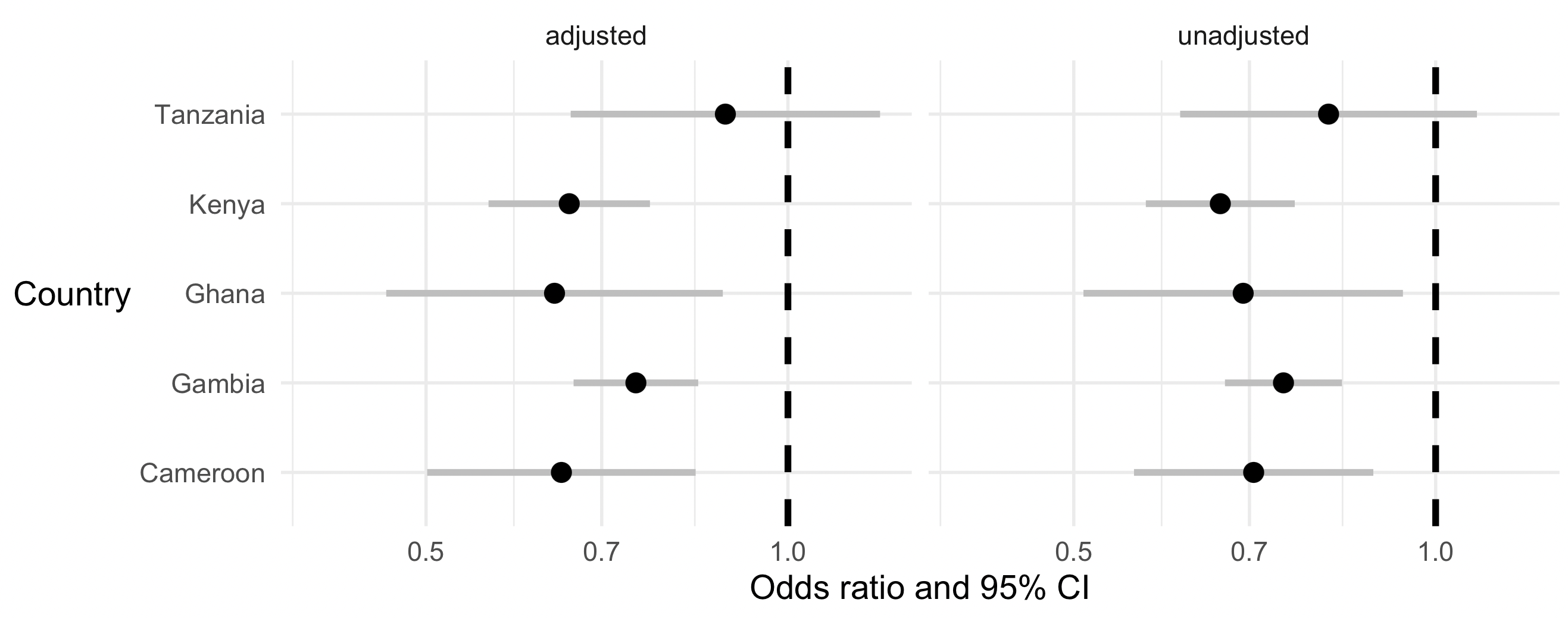
Revisiting the forest plot
Earlier we made a forest plot without covariates. Let's expand our test to see if including PCs or ethnicity makes much difference across the other populations.
You should have the fit_regression() helper function from that page - if not go back and paste it in again.
Check that it works in Kenya:
fit_regression( kenya, formula = status ~ o_bld_group + ethnicity + PC_1 + PC_2 + PC_3 + PC_4 + PC_5 )
You should get the same output as above, but in a slightly different data frame form that is more useful for forest plotting. Now let's get the unadjusted and adjusted estimates and put them in one output table:
estimates = (
    data
    %>% group_by( country )
    %>% reframe(
        fit_regression(
            pick( everything()),
            formula = status ~ o_bld_group
        )
    )
    %>% mutate( type = "unadjusted")
)

estimates = rbind(
    estimates,
    data
    %>% group_by( country )
    %>% reframe(
        fit_regression(
            pick( everything()),
            formula = status ~ o_bld_group + ethnicity + PC_1 + PC_2 + PC_3 + PC_4 + PC_5
        )
    )
    %>% mutate( type = "adjusted")
)
And plot it again:
p = (
    ggplot(
        data = estimates %>% filter( parameter == 'o_bld_group' )
    )
    + geom_segment(
        aes(
            x = exp( estimate - 1.96 * se ),
            xend = exp( estimate + 1.96 * se ),
            y = country,
            yend = country
        ),
        colour = 'grey',
        linewidth = 1.5
    )
    + geom_point(
        aes(
            x = exp( estimate ),
            y = country,
        ),
        size = 4
    )
    + facet_wrap( ~type )
    + xlab( "Odds ratio and 95% CI" )
    + ylab( "Country" )
    + geom_vline( xintercept = 1, linewidth = 1.5, linetype = 2 )
    + scale_x_log10( limits = c( 0.4, 1.2 ) )
    + theme_minimal(16)
    + theme( axis.title.y = element_text( angle = 0, vjust = 0.5 ))
)

print(p)
It should look somethig like this:
Beautiful!
Do the unadjusted and adjusted effects differ?
Is there any evidence that the effects are due to confounding?
Which of these statements do you agree with now?
- O blood group is associated with lower chance of having severe malaria, relative to A/B blood group.
- O blood group is associated with higher chance of having severe malaria, relative to A/B blood group.
- O blood group is protective against severe malaria.
- We can't tell if O blood group is protective or confers risk against severe malaria.
Further steps
Congratulations! This is the end of the main tutorial.
But mayube you want some more things to try? We have put a couple of extra challenges in the extra/ folder.