Visualising bivariate data
Let's now turn our attention to situations where we don't just have one, but two variables. Most often, we are interested in assessing how these two variables relate to one another. This can be achieved by creating bivariate plots.
Bivariate data can contain a combination of qualitative and quantitative variables. Let's look at these combinations one at a time.
Quantitative variable vs qualitative variable
Sometimes we are interested in understanding how a quantitative variable compares between several levels or groups of a qualitative variable. For example, are protein-coding genes and non-coding RNAs expressed at the same level?
Just plot the points!
Before carrying on let's fix our theme once and for all using theme_set():
my_theme = (
  theme_bw()
  + theme(
    plot.title       = element_text( hjust=0.5, size=16 ),
    panel.grid.minor = element_blank(),
    axis.title.y     = element_text( angle = 0, vjust = 0.5 )
  )
)
theme_set( my_theme )
The simplest way to show this would be just to plot the values:
p = (
    ggplot( mean_expression, aes( x = biotype, y = log_mean_TPM ))
    + geom_point()
    + ylab( "Mean expression (log-TPM)" )
    + xlab( "Gene type" )
    + ggtitle( "Gene expression distribution in GTEx" )
)
Hmm. Not very edifying - we can't really see the distribution of points. We could try jittering them instead by updating to:
geom_point( position = "jitter" )
But... it's ugly. Let's try something better.
Boxplots
A widely used tool for this type of question is the box plot. Box plot summarise the data by creating a box which contains the majority of the data points (more specifically, a box that represents the interquartile range). A line is used to indicate the average (median) value, and whiskers extend outside the box to indicate the full range of the data. Individual dots are also typically added to represent points that are very far away from the average value. Let's use boxplots to compare the average expression level of coding and non-coding genes.
To do so, we use ggplot. Note how we are asking ggplot to represent the gene family variable (i.e. coding vs non-coding)
in the X axis and the average expression level (log-TPM) in the Y variable. So we can explore, let's create a plot
object p with all this info that we can then add layers to:
p = (
    ggplot( mean_expression, aes( x = biotype, y = log_mean_TPM) )
    + ylab( "Mean expression (log-TPM)" )
    + xlab( "Gene type" )
    + ggtitle( "Gene expression distribution in GTEx" )
)
Now we can add a boxplot layer to p:
p + geom_boxplot()
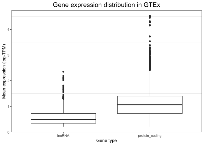
While a plot on its own is not enough to draw any conclusions (we would need a statistical test), this visualisation alone already suggests that non-coding RNAs could be expressed at a lower level compared to coding genes.
To see exactly what is plotted, see the geom_boxplot() documentation. In short:
- the box extends across between the 25% and 75% quartile (i.e. 50% of the data is in the box).
- the 'whiskers' extend out to the furthest-away points that are no more than 1.5 times the 'interquartile range' from the top/bottom of the box.
- Everything else is deemed an 'outlier' and plotted individually.
Of course these visualisation choices are just conventions, but it's a useful summary of the data.
Clearly these data have a fair few outliers - particular genes that have unusually high expression values.
Violin plots
An important caveat of box plots is that they assume the data shows central tendency (i.e. that the distribution has a big peak or bell shape, and that the tails of this distribution are more or less symmetric around this peak). This is not always the case, and in cases when this requirement is not fulfilled, box plots are less appropriate.
An alternative is to use violin plots. Violin plots basically consist of histograms or density plots for each variable, which have been turned upside down and put side by side to each other. This allows us to compare groups to each other, but does not assume any specific requirements and instead allows us to see the full distribution of the variable.
We can create violin plots in ggplot as follows. Note how the syntax is extremely similar to the box plot (only one line of code changes):
p + geom_violin()
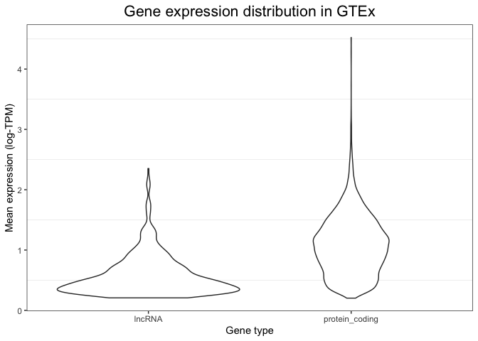
Maybe you want thinner violins?
p + geom_violin( width = 0.2 )
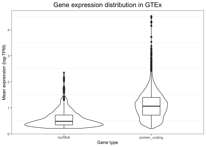
Into the multi(layer)verse
Because of the flexibility of ggplot, it is even possible to combine these two types of visualisations into a single plot - a multi-layered plot. We can do this by first drawing a violin plot (this is set as the first layer of our plot), and then adding on top of it a boxplot (which is overlaid as a second layer). The syntax to do this is shown below. Note how now we have extensive information: we can see the full distribution in the violin plot, but we also obtain summary variables (like the median value and the box edges) that can be easily compared between groups.
(
    p
    + geom_violin()
    + geom_boxplot( width = 0.2 )
)
Examining tissues
So far we've just looked at expression values averaged across tissues. Let's pivot now to looking at values in multiple tissues at the same time.
We will begin by reformatting the GTEx expression table into a data frame so as to have a column containing tissue
labels. This is necessary because we want to compare tissues to each other, and thus we need them to be in the form of a
categorical variable. The pivot_longer() function in the tidry package
package allows us to do this:
# First turn it back into a data frame and add the gene name in:
gtex_log_df = bind_cols(
  gene = rownames(gtex_log ),
  as_tibble( gtex_log )
)
gtex_log_reshaped = tidyr::pivot_longer(
    gtex_log_df,
    cols = 2:ncol(gtex_log_df),
    names_to = "tissue",
    values_to = "log_TPM"
)
You can see what this has done by printing it:
head(gtex_log_reshaped)
# A tibble: 6 × 3
  gene      tissue                     TPM
  <chr>     <chr>                    <dbl>
1 LINC01128 Adipose_Subcutaneous     0.926
2 LINC01128 Adipose_Visceral_Omentum 0.944
3 LINC01128 Adrenal_Gland            0.702
4 LINC01128 Artery_Aorta             0.993
5 LINC01128 Artery_Coronary          0.988
6 LINC01128 Artery_Tibial            1.08
Note how tissues (which were previously represented as separate columns) have now been collapsed into a single column, with its adjacent label.
Bar plots
Bar plots are a useful alternative when we are comparing multiple groups or levels of a qualitative variable. They are reliable because they rely in representing quantities as lengths, and they are particularly useful when we only have one value per category. Let's look at some example bar plots by comparing the expression level of a few genes of interest across different tissues.
Let's start by inspecting the expression level of MYH7, a gene encoding the beta myosin heavy chain. We expect this gene to be specific to muscular tissue, since myosin is involved in muscle contraction.
We use ggplot to visualise gene expression values (log-TPM) across different tissues in a bar plot format, based on the code below. There are several details to note in this code. Firstly, note how we are not using the whole table: we subset it so that ggplot only sees the rows that correspond to MYH7. Secondly, note how we are not specifying the Y coordinate anymore. This is because we are no longer using the Y position as a plotting channel, instead we are using lengths, which are specified within with the "weight" parameter. Finally, note the "coord_flip" indication. This flips our axes, so that the X axis becomes the Y axis and vice versa. The only purpose of this line is to make the plot more readable, since having tissues in the X axis would result in them cramming and the labels being difficult to read.
(
  ggplot(
    data = gtex_log_reshaped %>% filter( gene=="MYH7" ),
    aes( x = tissue )
  )
  + geom_bar( aes( weight=log_TPM ))
  + xlab("")
  + ylab("Gene expression (log-TPM)")
  + ggtitle("MYH7 expression")
  + coord_flip()
)
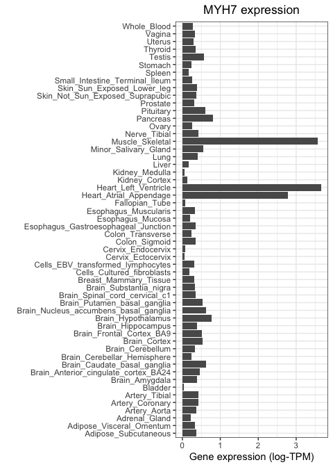
As expected, MYH7 is highly expressed in heart and skeletal muscle, but not in other tissue types.
Let's now repeat this, but using a neuronal marker. We will focus on SYP, which encodes the protein synaptophysin, known to be important for neuronal synapses. We use the same code as above, but changing our subsetting strategy so that only SYP values are fed to ggplot:
(
  ggplot(
    gtex_log_reshaped %>% filter( gene=="MYH7" ),
    aes(x=tissue)
  )
  + geom_bar( aes( weight=log_TPM ) )
  + xlab( "" )
  + ylab("Gene expression (log-TPM)")
  + ggtitle("Synaptophysin expression")
  + coord_flip()
)
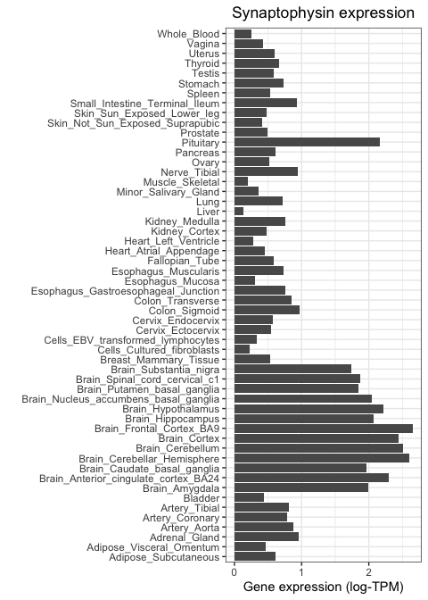
Notice how this gene is highly expressed across all brain regions and in the pituitary, but shows much lower activity everywhere else.
ggplot superpower: facetting
Wouldn't it be good if we could get both genes on the same plot as once? This is a job for facetting:
(
  ggplot(
    gtex_log_reshaped %>% filter( gene %in% c( "MYH7", "SYP" ) ),
    aes(x=tissue)
  )
  + geom_bar( aes( weight=log_TPM ) )
  + xlab( "" )
  + ylab("Gene expression (log-TPM)")
  + ggtitle("Synaptophysin expression")
  + coord_flip()
  + facet_wrap( ~gene )
)
Wow! Feel free to add some more genes in there.
Quantitative vs quantitative
Sometimes we are interested in comparing two quantitative variables to each other. For example, how similar are two tissues to each other in terms of their gene expression? Or, are two genes of interest similar or different in their expression pattern? The most basic tool for answering this is the scatter plot.
Scatter plots
As an example, let's compare two tissues to each other: subcutaneous adipose tissue and visceral omentum. Both of these tissues are mostly composed of adipocytes, so we would expect them to be very similar when it comes to their gene expression profiles. To test this, we can take the level of each gene in tissue 1 and visualise it against its level in tissue 2. We do this for each of the 14,000 genes in the GTEx study, where each gene is represented as a dot.
Scatter plots van be generated in ggplot by using the geom_point() function to specify that we want to use points as
marks to represent data points. The code below results in a scatter plot comparing the two tissues in question.
First (because ggplot2 doesn't accept a matrix as input, only a data frame) we convert gtex_log back to a data frame
(we'll keep using tibble, the tidyverse flavour of a dataframe for this):
gtex_log_df = bind_cols(
  gene = rownames(gtex_log ),
  as_tibble( gtex_log )
)
Now we can make the scatter plot:
scatter_plot = (
  ggplot(
    gtex_log_df,
    aes( x=Adipose_Subcutaneous, y=Adipose_Visceral_Omentum )
  )
  + geom_point(color="darkgrey")
  + xlab("Gene expression (Subcutaneous adipose tissue)")
  + ylab("Gene expression (Visceral omentum tissue)")
  + theme_bw()
)
print( scatter_plot )

Visual inspection suggests that these two tissues are highly similar, but we need a statistical test that can tell us whether this is actually the case. For example, we can compute the Pearson correlation coefficient between both tissues and perform a test to infer whether this correlation is significantly different than zero.
Let's use ggplot to add a linear regression fit:
print(
    scatter_plot
    + geom_smooth( method = "lm" )
)
Note there's so much data here, that the error bars on the line are... invisible!
The ggpubr library also allows us to easily add a statistical test against the null that the correlation is zero.
All we need to do is add a new layer containing the results from a correlation test (stat_cor()), as follows:
library( ggpubr )
print(
    scatter_plot
    + geom_smooth( method = "lm" )
    + stat_cor()
)
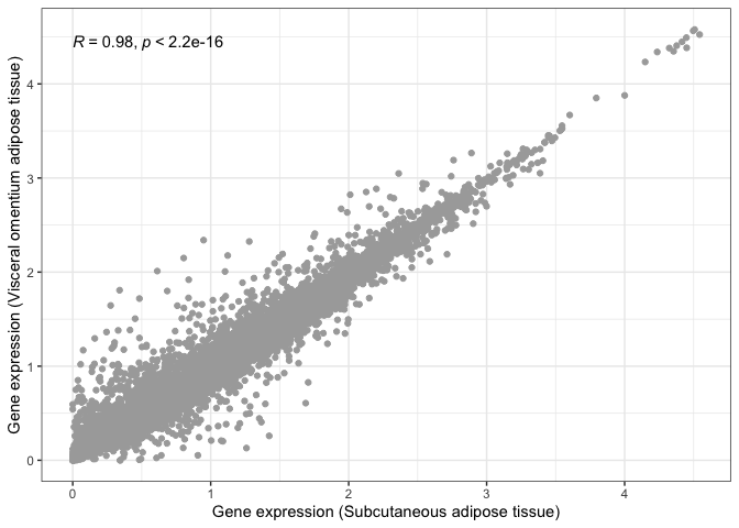
We can now say for certain that both adipose tissues are significantly and highly correlated.
Let's now repeat this, but comparing two tissues that we would expect to be very different from one another: subcutaneous adipose tissue and the hippocampus (i.e. neuronal tissue):
scatter_plot_2 = (
  ggplot(
    gtex_log_df,
    aes( x = Adipose_Subcutaneous, y = Brain_Hippocampus )
  )
  + geom_point( color = "darkgrey" )
  + xlab( "Gene expression (Subcutaneous adipose tissue)" )
  + ylab( "Gene expression (Brain hippocampus)" )
)
print( scatter_plot_2 + stat_cor() )
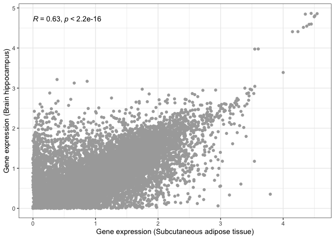
This is where visualisation becomes extremely useful. The statistical test still tells us that both tissues are significantly correlated, albeit with a lower correlation magnitude. However, if we look at our scatter plot in more detail, we will see that there are now two groups of dots: genes that correlate in both tissues tend to form a straight line, while genes that do not correlate between tissues tend to locate at the edges, close to the X and Y axes.
This is probably due to some genes being essential and expressed by every tissue, with other genes being tissue-specific.