Part 3: Linear regression of GC vs chromosome length
Let's now try a different type of model - a linear regression model.
Linear regression model is like logistic regression but has a couple of key differences.
First, linear regression applies to continuous outcome variables. The outcome is modelled as having a normal distribution (given the parameters).
Second, there's no 'odds' and 'log-odds' to worry about - the parameters are on the same scale as the outcome.
Linear regression example
For a simple example let's look at GC content versus chromosome lengths. If you remember that example in the R tutorial? We saw that, for the human genome, GC content seems to be inversely related to chromosome length. Let's use linear regression to estimate this relationship now. We'll do it for humans and also for a couple of other organisms.
The data can be found here. You should be able to load the data like this:
library( tidyverse )
data = read_tsv( "https://www.chg.ox.ac.uk/bioinformatics/training/msc_gm/2024/data/gc_versus_chromosome_length.tsv" )
Print out the data frame to see what variables it holds. You should see several columns reflecting the organism, chromosome, chromosome length, and gc percent.
Always do your due diligence! Explore the dataset now.
In particular, what values does the organism column hold? What chromosomes are there?
Plotting
Before going further let's plot the data again. We'll use ggplot for this so we can see all the organisms at once. First, I like the 'minimal' theme so let's set that now:
library( ggplot2 )
ggplot2::theme_set(theme_minimal( 16 ))
Now let's plot. The facet_grid() function can be used to split the plot over the different organisms:
p = (
    ggplot( data = data )
    + geom_point( aes( x = length_in_mb, y = gc_percent ))
    + facet_grid( organism ~ . )
)
print(p)
Fitting linear regression
Ok, let's estimate the relationship between the two variables (GC content and chromosome length). We'll do this by fitting a linear regession model, using the function lm().
Fitting the model is even easier than the logistic regression example. Instead of using glm() ("generalised linear model" )we will simply use lm() ("linear model") - and we don't need the family argument either. We'll just use the chromosome length_in_mb as predictor, so we can fit it like this:
fit = lm(
    gc_percent ~ length_in_mb,
    data  = data %>% filter( organism == 'human' )
)
As before the best way to look at the fit is to get the coefficients, that is, the estimated parameters. This can be done like this:
summary( fit )$coeff
It should look something like this:
> coefficients( summary( fit ))
                Estimate  Std. Error   t value     Pr(>|t|)
(Intercept)  44.31484709 1.088899945 40.696895 3.324169e-22
length_in_mb -0.02365607 0.007746123 -3.053924 5.818152e-03
Interpreting the results
Unlike logistic regression, all the estimates above are on the same scale as the outcome variable - the gc_percent variable.
Let's just focus on this bit for now:
                Estimate  Std. Error
(Intercept)  44.31484709 1.088899945
length_in_mb -0.02365607 0.007746123
What you see there are the parameter estimates and their standard errors.
Essentially, lm() has fit a straight line of the form
We can plot this straight line to get a better sense of the results. We'll plot the data and then add on the line that the regression model has fit:
p = (
    ggplot( data %>% filter( organism == 'human' ) )
    + geom_point( aes( x = length_in_mb, y = gc_percent ))
    + geom_abline( intercept = 44.3, slope = -0.0237, col = 'red' )
)
print(p)
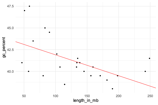
Does it look like a good fit?
What these results mean is that - under the model:
- The estimated GC percent for a hypothetical zero-length chromosome is 44.3 (!)
- The model estimates that each increase by 1Mb corresponds to a 0.024% decrease in GC content.
The longest chromosome is around 250Mb long, while the shortest is under 50Mb. So this estimate would correspond to about five percent difference in GC content between the longest and shortest chromosomes.
Look back at the plot - does this work about right?
The model
As you'll have noticed, the points don't lie exactly on the line. This is natural for linear regression and works as
follows. Linear regression models the outcome variable (gc_percent) as a linear function of the predictor variable
(chromosome length) plus some residual noise. This residual noise is assumed to be normally distributed.
Roughly speaking, the model fitting process finds the line that minimises these residuals as much as possible.
Specifically linear regression minimises the sum of squared errors - that is, it 'minimises residual noise' in the sense of trying to get the average squared vertical distance of each point to the line, as small as possible.
The residuals (difference of the true gc_percent to the line) can be obtained using residuals(fit). Let's use that now to plot them:
hist( residuals(fit), xlab = "Residual" )
We could also **compare the residuals to expected residuals (if the model were true):
human_data = data %>% filter( organism == 'human' )
residual_data = tibble(
    expected = qnorm(
        1:nrow(human_data) / (nrow(human_data)+1),
        sd = sigma(fit)
    ),
    residual = sort( residuals( fit ))
)
(
    ggplot( data = residual_data )
    + geom_point( aes( x = expected, y = residual ))
)
If the model fits well, you should roughtly see a diagonal line - do you? (Try adding a geom_abline() to see.)
The type of plot we have just made is known as a quantile-quantile plot.
It plots the expected quantiles of a variable (x axis) against the observed quantiles (y axis).
Here we have applied it to the residuals, which (if the model fits well) are supposed to be normally distributed, and we see that indeed they line up quite well.
Interpreting the standard errors
In this output:
coefficients( summary( fit ))[,1:2]
                Estimate  Std. Error
(Intercept)  44.31484709 1.088899945
length_in_mb -0.02365607 0.007746123
The second column are the standard errors. What are they?
The standard errors express the uncertainty we should have in the parameter estimates. In other words, even though the line is the best fit, other lines might also be possible.
Probably the simplest way to interpret the standard errors is to convert them to credible/confidence intervals. This is easy. If the parameter estimate is and the standard error is , the 95% confidence interval is:
This is an approximation which happens to hold well for all the models we'll look at. We'll assume it is accurate for this module.
Theoretically this holds when the likelihood function is well-approximated by a normal distribution. Because likelihoods sum over lots of data points, this approximation usually works well as long as there is lots of data.
Let's plot that now. We'll take the opportunity to set up a dataframe for all three organisms, but let's start with the estimates in humans:
forest_plot_data = tibble(
    organism = c( "human" ),
    beta = c( -0.02365607 ),
    se = c( 0.007746123 )
)
Let's make the forest plot like in the lecture. We can use geom_segment() to draw lines, and geom_point() to draw
the points:
p = (
    ggplot( data = forest_plot_data )
    + geom_segment(
        aes(
            x = beta - 1.96 * se,
            xend = beta + 1.96 * se,
            y = organism,
            yend = organism
        )
    )
    + geom_point(
        aes(
            x = beta,
            y = organism
        ),
        size = 2
    )
)
print(p)
Hmm... to make this better, let's fix the x axis scale and add a line at 'no association'. And while we're at it, let's make it into a re-useable function as well so we can use it later:
draw_forest_plot = function(
    forest_plot_data,
    xlim = c( -0.05, 0.02 )
) {
    forest_plot_data$lower = forest_plot_data$beta - 1.96 * forest_plot_data$se
    forest_plot_data$upper = forest_plot_data$beta + 1.96 * forest_plot_data$se
    print( forest_plot_data )
    p = (
        ggplot( data = forest_plot_data )
        + geom_segment(
            aes(
                x = lower,
                xend = upper,
                y = organism,
                yend = organism
            )
        )
        + geom_point(
            aes(
                x = beta,
                y = organism
            ),
            size = 2
        )
        + xlab( "Slope of association" )
        + xlim( xlim[1], xlim[2] )
        + geom_vline( xintercept = 0, linetype = 2 )
        + theme( axis.title.y = element_text( angle = 0, vjust = 0.5 ))
    )
    return(p)
}
draw_forest_plot( forest_plot_data )

Cool!
This plot shows us - as long as we believe the model - that:
- The point estimate of the association is -0.024, over to the left of the 'no association' line
- The 95% credible interval is also over to the left of the 'no association' line. In other words (if we believe the model) there is evidence that the slope really is nonzero.
There's also a p-value, which is . Does this mean anything here?
A direct way to interpret this is that, we can be about 99.4% percent sure the slope is less than zero.
This is the bayesian interpretation of these results. In effect, 99.4% of the posterior mass lies to the left of the line.
The frequentist interpretation is harder to figure here - it is hard to see how we could 'repeat' this experiment! (There's only one human species after all). The small P-value does give me some confidence that this -ve slope is not just arising from random chance.
All the organisms together
Let's repeat this for the other two organism.
The simplest way to do this is write a function to return the beta and se estimates and then have dplyr run it over each organism in the data:
fit = function( data ) {
    result = lm(
        gc_percent ~ length_in_mb,
        data = data
    )
    coeffs = summary(result)$coefficients
    return(
        tibble(
            beta = coeffs[2,1],
            se = coeffs[2,2]
        )
    )
}
forest_plot_data  = (
    data
    %>% group_by( organism )
    %>% summarise( fit( cur_data() ))
)
Look at the forest_plot_data data frame and make sure it has estimates for all three populations. And let's plot them:
draw_forest_plot( forest_plot_data )
How do you interpret this plot?
Why is it called a 'forest plot'? Apparently it's because it shows a 'forest' of lines - as described in this paper. But the term only came into use in the 1990s.