Visualising multivariate data
While visualising one or two variables at a time is useful, the power of high-throughput experiments like RNA-seq lies on the fact that they can measure thousands of variables at once. Thus, ideally we want to be able to include as much of this information as possilbe in our visualisations. This is made possible by multivariate data analysis techniques. These can be roughly divided into visualisation and dimensionality reduction tools.
Heatmaps
Heatmaps are amongst the most powerful techniques for visualising multivariate data. They rely on 'tricking' the eye into perceiving color hues as a cointinuous variable. In this way, colour can be used to encode quantitative variables. For example, we can order colours following the rainbow spectrum or from "cold" (blue) to "hot" (red) colors. In addition, the rows and colours of a heatmap are grouped by similarity according to clustering algorithms, so as to draw the eye to the most evident patterns.
In functional genomics, heatmaps usually represent features (e.g. genes) as rows and samples (e.g. tissues) as columns of the heatmap, with each cell beling coloured according to the measured level of expression.
The most straightfoward way to generate heatmaps in R is by using the pheatmap library (which literally stands for Pretty Heatmap). For example, the code below generates a heatmap of all >14,000 genes and 54 tissues in the GTEx study:
library( pheatmap )
pheatmap( gtex_log, show_rownames = F )
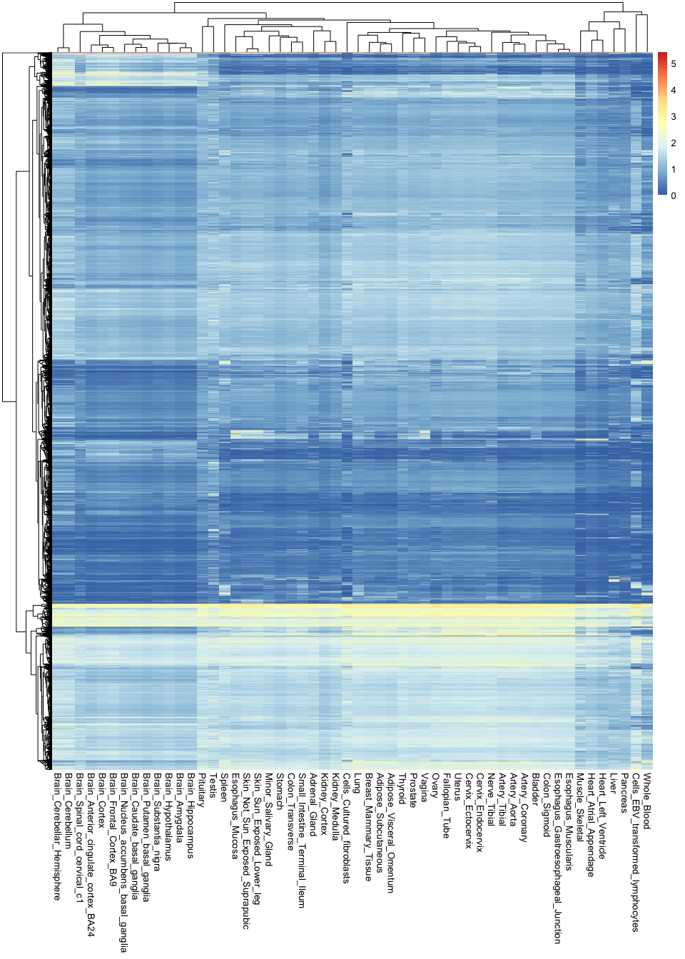
Note the sheer amount of information encoded in a single image: there are over 760,000 observations in this plot.
These types of visualisations are useful for finding general patterns in the data. For example, you can see here that all brain tissues are grouped together and tend to have a group of very specific genes that are active in them. However, it is hard to recover any specific or finer details, because there is simply too much information in the image.
If we want to circumvent this issue, it is key to remember that not all variables are equally important: some genes are so essential that they will be expression everywhere at the same level, and are thus irrelevant for distinguishing between tissues. In contrast, some genes are extremely specific (e.g. only active in the brain), and these are the most useful for understanding tissue differences. Thus, it would be ideal to recover the most relevant variables while discarding any unnecessary information.
One way of doing this is by ranking genes according to how variable they are across tissues. If they don't vary at all, they probably are not very interesting. In contrast, if they show a high level of variability, it is likely that they are only being expressed in one or a handful of tissues.
Let's try this approach by calculating the variance of each gene across tissues. Variances measure the extent of
variability of a variable. In this case, we can use the rowVars() function (from the 'matrixStats' package) to compute
these variances, which we will add as a new column to our mean_expression object:
library( matrixStats )
mean_expression$expr_var <- rowVars( gtex_log )
Let's now use ggplot to compare the average expression of each gene to its variance. Variance is represented here in the Y axis:
(
    ggplot(
        mean_expression,
        aes( x = log_mean_TPM, y = expr_var )
    )
    + geom_point( color = "darkgrey" )
    + xlab("Mean expression (log-TPM)")
    + ylab("Expression variance")
)
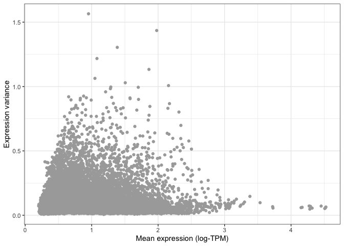
You can already see that the vast majority of genes have very low variance, and are thus likely to be uninformative.
This is even more apparent when we colour different areas of the plot based on the density of points, as shown below.
This is particularly useful when looking at data set with a very large number of points, where it is difficult to
distinguish which areas of the plot contain more data. To do so, we can ask ggplot to add a geom_hex() layer, which
divides the plotting area into hexagons whose colour is proportional to the number of data points contained in that
region:
(
    ggplot(
        mean_expression,
        aes(x=log_mean_TPM, y=expr_var)
    )
    + geom_hex( bins = 50 )
    + xlab( "Mean expression (log-TPM)" )
    + ylab( "Expression variance" )
)
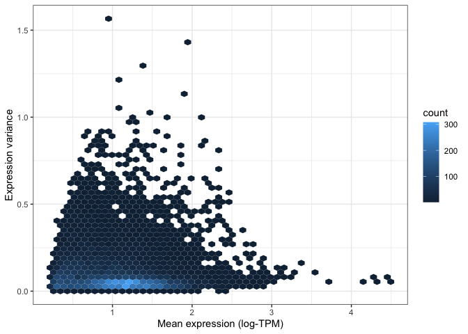
Both of the above visualisations make it clear that only a few hundreds genes are very variable across tissues, and we might want to explore these genes in more depth. For instance, let's take the top 100 most variable genes in the data set. We do this by using the "order" function to rank genes decreasingly by their variance. We then extract the first 100 genes in this ranked list:
top_100_var_genes <- order( mean_expression$expr_var, decreasing = T )[1:100]
We can now use the pheatmap library to visualise these 100 variable genes across all tissues in the GTEx study:
pheatmap(
    gtex_log[top_100_var_genes,],
    show_rownames = T,
    fontsize_row = 7.5
)
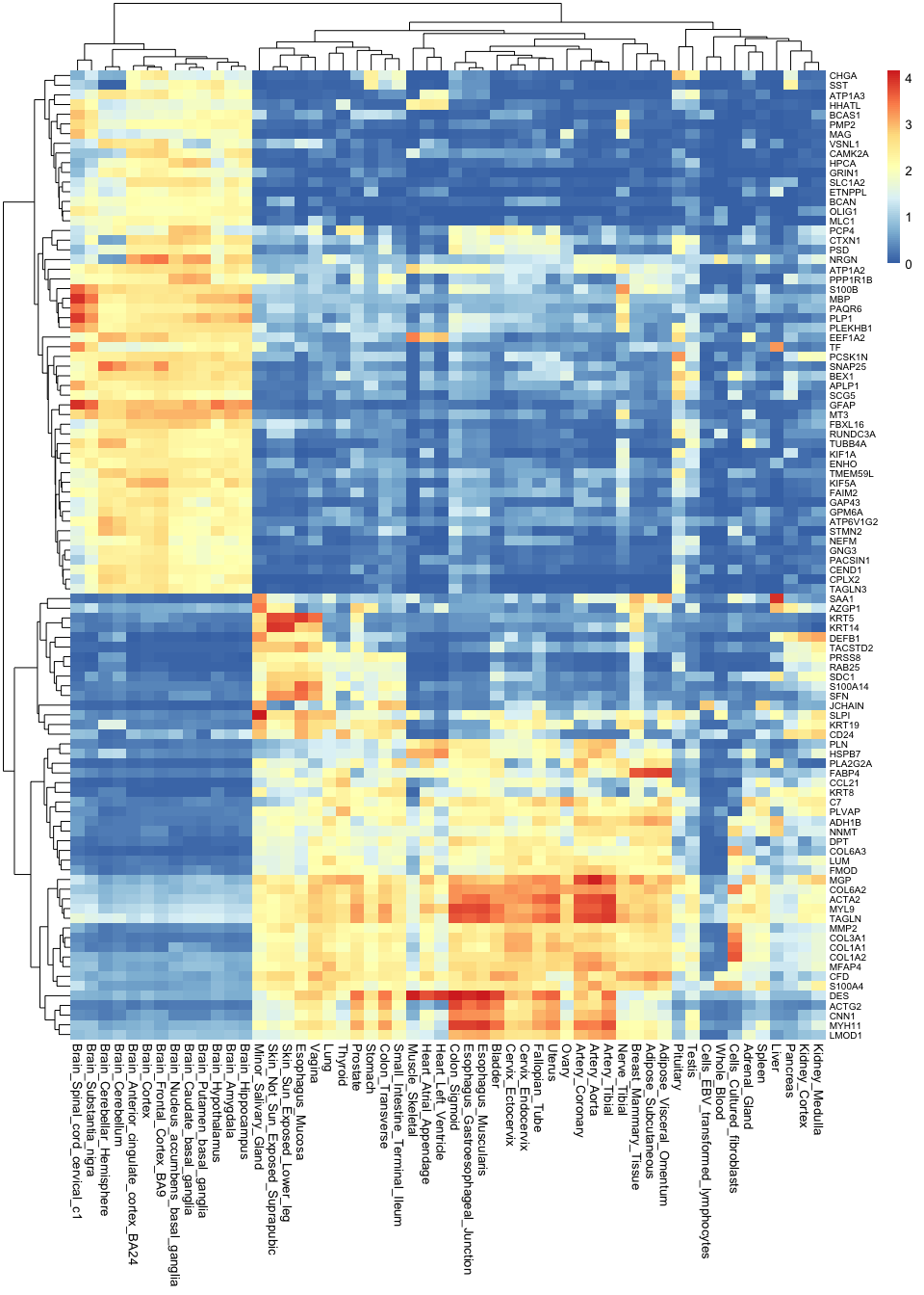
Note how much insights we gain by taking the most variable genes: now we not only know that brain tissues are grouped together, but we can also begin to understand why this is. We can see which genes tend to be active in the brain but not in any other tissues, and we can use this as a basis to understand the functions of each tissue.
Correlation plots
Another approach to understanding multivariate data is by using correlations. For example, which tissues are most similar to one another, and which are different? To answer this question, we can calculate the correlation between all pairwise combinations of tissues. The results from this is called a correlation matrix.
To compute a correlation matrix in R, you can simply use the cor() function: R will automatically detect that you are
inputting a table, and will thus calculate a full correlation matrix between all columns of the table for you. Note that
we are only using the top 1,000 most variable genes for this calculation. This is because, the more variables you use,
the longer it will take for R to perform this computation. Since we already showed that most genes are not very
informative, taking the top 1000 should be enough to differentiate tissues from each other.
top_1000_var_genes <- order( mean_expression$expr_var, decreasing = T )[1:1000]
gtex_cormat <- cor( gtex_log[top_1000_var_genes,] )
We now have a correlation matrix. Below you can see the first 5 rows and columns of this matrix. Note how all values in the diagonal are 1, since we are comparing a tissue to itself, and thus the values are identical. Note also that the matrix is symmetric with respect to this diagonal. This is because correlations are the same regardless of the order of the variables (i.e. the correlation value is the same whether you compare adrenal gland to coronary artery or coronary artery to adrenal gland).
gtex_cormat[1:5,1:5]
                         Adipose_Subcutaneous Adipose_Visceral_Omentum Adrenal_Gland Artery_Aorta Artery_Coronary
Adipose_Subcutaneous                1.0000000                0.9563809     0.6810204    0.8249191       0.8904570
Adipose_Visceral_Omentum            0.9563809                1.0000000     0.7059080    0.8087838       0.8767685
Adrenal_Gland                       0.6810204                0.7059080     1.0000000    0.6493837       0.6772025
Artery_Aorta                        0.8249191                0.8087838     0.6493837    1.0000000       0.9635597
Artery_Coronary                     0.8904570                0.8767685     0.6772025    0.9635597       1.0000000
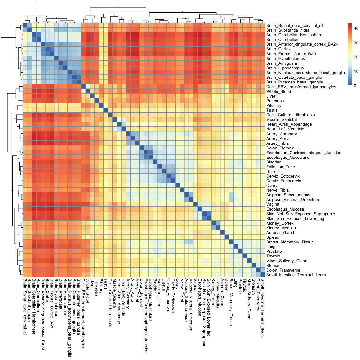
We can visualise this correlation matrix as a heatmap. Note that now the colours of the heatmap represent the correlation coefficient between pairs of tissues:
pheatmap( gtex_cormat, fontsize = 8 )

While you are only seeing around 2900 variables in this plot (which is the size of the correlation matrix), the information contained in it is really a summary of 54,000 observations. Note how you can recover a lot of structure as well: we can now see how tissues in the gastrointestinal tract are similar to one another, and how mucosal tissues form a distinct group.
Distance matrices and hierarchical clustering
Just like tissues can be compared to each other using correlations, they can also be compared using "distances". If we think of each gene as axes or variables in space, distances literally tell us how far away two tissues are from each other in such a space.
In R, we can calculate distances using the dist() function. Just like with the correlation matrix above, we will
restrict this calculation to the top 1,000 most variable genes only, so as to reduce the time it takes to do the
computation. There are many types of distances. Here we will simply use the "Euclidean" distance, which means the length
of a straight line connecting the two tissues of interest. Note that R will automatically calculate the distances
between all pairwise combinations of tissues in a single line of code:
gtex_dist <- dist( t( gtex_log[top_1000_var_genes,]), method = "euclidean" )
The resulting distance matrix is shown below. Again, the matrix is symmetric (since distance estimates are independent of variable order) and the diagonal is made of zeros, since by definition the distance of a point to itself is zero (they occupy the same position in space).
as.matrix(gtex_dist)[1:5,1:5]
                         Adipose_Subcutaneous Adipose_Visceral_Omentum Adrenal_Gland Artery_Aorta Artery_Coronary
Adipose_Subcutaneous                 0.000000                 8.267723      21.90200    17.810502       13.965275
Adipose_Visceral_Omentum             8.267723                 0.000000      20.83164    18.364102       14.532707
Adrenal_Gland                       21.902005                20.831643       0.00000    25.225716       23.993467
Artery_Aorta                        17.810502                18.364102      25.22572     0.000000        8.274076
Artery_Coronary                     13.965275                14.532707      23.99347     8.274076        0.000000
Just as with the correlation matrix, distance matrices can also be visualised as heatmaps:
pheatmap( as.matrix(gtex_dist) )
You'll notice that this heatmap is essentially the opposite of the correlation heatmap: a high correlation equates to a small distance.
Distances are not only useful for visualisation though: they enable us to cluster tissues into groups according to how
far away they are from each other. One simple method to do this is hierarchical clustering, which puts tissues into
a "family tree" (or dendrogram, which is the correct term) according to how similar they are to each other. The
hclust() function allows us to seamlessly perform hierarchical clustering in a distance matrix:
gtex_hclust <- hclust(gtex_dist)
We can then use base R's plotting function to visualise the resulting dendrogram:
plot(
  gtex_hclust
)
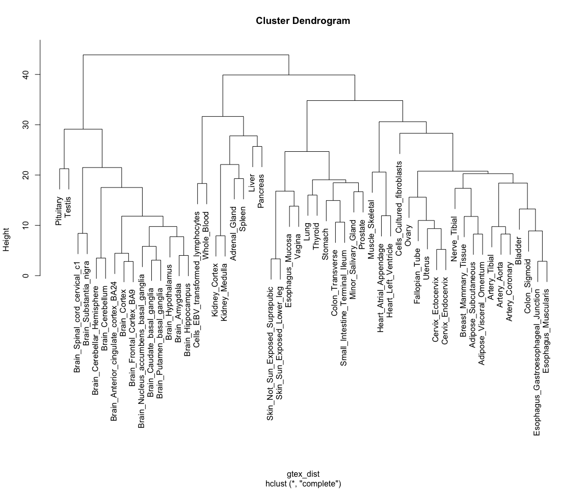
Note how tissues are arranged into clear blocks that make biological sense: all brain samples are together, with the cerebellum forming a separate sub-branch; GI tract tissues tend to form a separate group, as do arterial tissues and mucosal tissues; etc...
This is, essentially, how pheatmap() is already ordering rows for us in the heat maps above!
Dimensionality reduction
Finally, we will explore a technique for summarising the >14,000 dimensions in the GTEx data into a set of 2 to 3 variables, a technique called dimensionality reduction. We will focus on one such technique in particular: Principal Component Analysis (PCA)
PCA
PCA is a technique for identifying the most important axes of variation in a multivariate data set. For a review on the principles of PCA you can refer to the associated slides.
PCA can be performed using the prcomp() function in R, as shown below. Just like in the previous section, we perform our analysis using only the top 1000 most variable genes. Note how we can then extract different outputs of the algorithm, such as the principal components themselves ($x), as well as the amount of variability explained by each of the components ($sdev):
gtex_pcs <- prcomp( t(gtex_log[top_1000_var_genes,]) )

# Fetching coordinates and proportion of variance explained for each component
gtex_pc_coords <- as_tibble(gtex_pcs$x)
pc_vars <- gtex_pcs$sdev^2/sum(gtex_pcs$sdev^2)*100
Principal components are ordered by importance, and usually looking at the first few is enough to get a good summary of the whole structure of a data set. Let's assess how much variance is captured by each component in the GTEx data:
plot(
  pc_vars,
  type = "b",
  ylab="Variance explained (%)",
  xlab="Principal component"
)
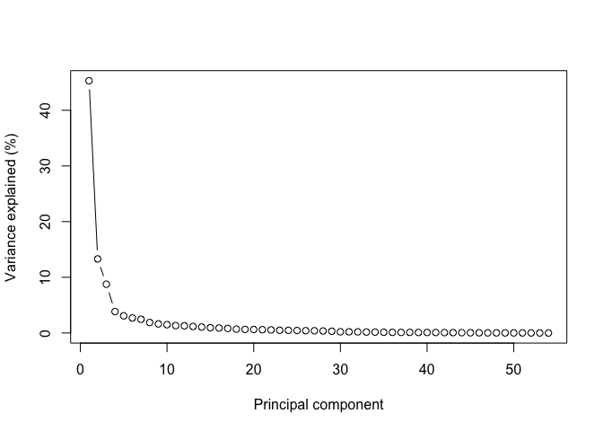
Note how looking at the first two components gives us close to 60% of the information contained in the data!
Let's thus look at these first two components by plugging them into a ggplot function:
(
    ggplot(
      gtex_pc_coords,
      aes( x = PC1, y = PC2 )
    )
    + geom_point( size = 5 )
)
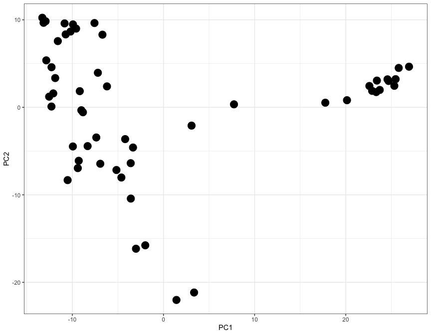
Here each dot represents a tisue, and the X and Y axes (PC1 and PC2) contain information from thousands of genes, all compressed into just two axes.
Let's use the ggrepel library to add labels and colours to each dot, so that we can undenrstand which tissue is which:
library( ggrepel )

gtex_pc_coords$tissue <- colnames(gtex_log)

(
    ggplot(
      gtex_pc_coords,
      aes(x=PC1, y=PC2)
    )
    + geom_point( aes( color = tissue ), size = 5 )
    + geom_label_repel( aes( fill = tissue, label = tissue), size = 3, max.overlaps = 17 )
    + theme_classic()
    + theme(legend.position = "none")
)
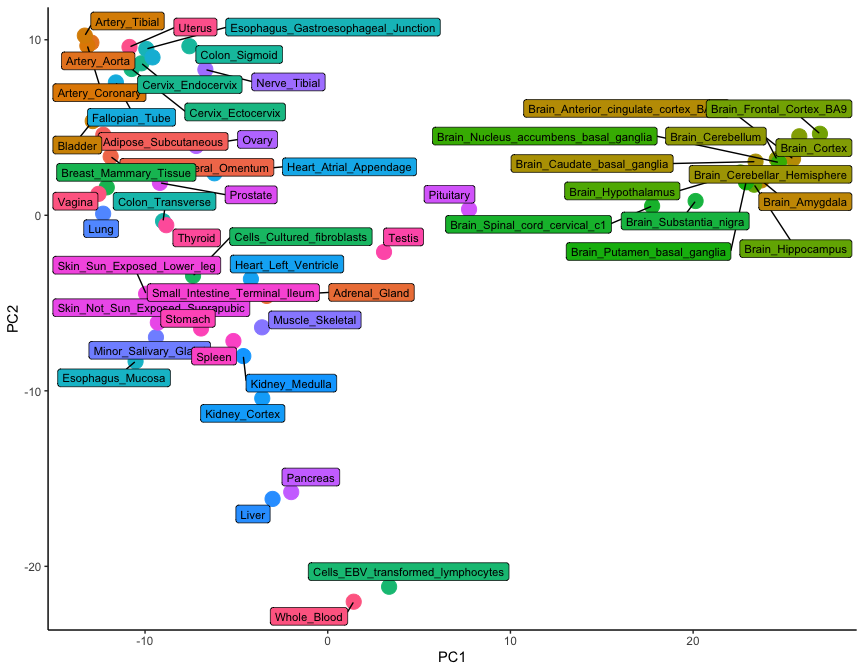
While only 54 dots are shown on this plot, the graph is a summary of 54,000 observations. This is clear from the level of detail that this plot contains: note how brain tissues form a group on the right-hand side, while arterial tissues group together on the top left corner. In addition, lymphoid cells (whole blood and transformed lymphocytes) separate at the bottom of the plot, as do the pancreas and the liver. It is clear how the position of tissues in this visualisation really is the summary of thousands of different gene expression observations.
Conclusion
In this tutorial we have learned how to use ggplot and other associated packages to visualise multivariate data. We did this by looking at a specific example of RNA-seq data derived from the GTEx project.
If you are interested to try more examples, see the additional data visualisation with ggplot2 tutorial.