Visualising the data
Visualisation is usually the first step when exploring a data set, since it enables us to assess data quality and identify any major patterns. Which techniques and types of graphs we use for visualisation is determined by the nature of our data. For example, how many variables do we have? What are we interested in assessing?
In this tutorial, we will begin by visualising a single variable, and then gradually incorporate more variables into our exploratory analysis.
Univariate data
The most simple visualisation task is plotting a single variable. This falls under the umbrella term of univariate data analysis. Here, we will use univariate data visualisation to illustrate one of the most important steps in RNA-seq data analysis: data transformations.
Let's start by assessing how high the expression of each gene is on average across all tissues. To do so, we use the rowMeans() function and apply to the GTEx data. This function will take each row of the expression table (which, as we have seen, corresponds to a gene) and its average value across all columns. Thus, will give us the mean expression of each gene in the study.
We save these results into a new variable called mean_expression, which also contains the name and family of each gene.
mean_expression <- tibble::tibble(
  gene_name = rownames(gtex),
  biotype   = gene_annotations$biotype,
  mean_TPM  = rowMeans(gtex)
)
Data transformations
For a quick visualisation of this variable, we can use the hist() function to generate a histogram. This histogram shows us the distribution of gene expression values in our study:
hist(
  mean_expression$mean_TPM,
  breaks=100,
  xlab = "Mean expression across tissues (TPM)",
  main="Gene expression distribution"
)
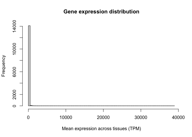
Note the oddness of this histogram: it seems like the vast majority of values are close to zero, while a few genes have expression values as high as 30,000 TPM. In situations like this, we say the variable spans a dynamic range. In other words, some values are tiny and some are huge, and the increases are not necessarily linear. RNA-seq counts are always distributed in this way.
To circumvent this problem, we use a data transformation to make this variable behave more linearly. For example, we can take the logarithm of the GTEx expression values, as follows:
gtex_log <- log10(gtex+1)
Why not just do here? Can you tell?
This trick is a common way to transform values like this, that vary over orders of magnitude but also can be very small.
Let's now calculate the average log-TPM value for each gene and add it as a new column in our "mean_expression" variable:
mean_expression$log_mean_TPM <- rowMeans(gtex_log)
Because of the way logarithms are defined, now genes with values of 10, 100, or 1000 TPM, which used to be very far away from each other, have closer (they would be 1,2, and 3 in the log scale).
Let's generate a histogram for this new variable. Note how we now have a distribution of values with central tendency (i.e. a clear peak).
hist(
  mean_expression$log_mean_TPM,
  breaks=100,
  xlab = "Mean expression across tissues (TPM)",
  main="Gene expression distribution"
)
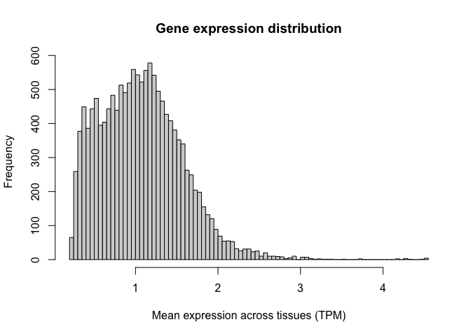
Logarithms are the most common used transformation in RNA-seq data analysis, and expression values are almost always shown in log scale.
Histogramming with ggplot
Now that we have transformed our data in the way we want to, we can begin to explore how to use ggplot. The ggplot library is an extremely flexible group of functions which allows us to create plots that are personalised and fine-tuned, where we can specify each little detail we want to show.
Let's illustrate this by recreating the histograms shown above, but now using the ggplot package. For a review of the syntax required by ggplot, you can refer to the associated slides.
To construct a ggplot, we must specify the data set of interest (this should be a data.frame object, such as our
mean_expresssion variable) and the variables we want to plot (in this case, the average log-TPM value for each gene).
Next, we need to specify the type of visualisation that we want (here, a histrogram). We can add multiple visualisations
one on top of the other, as layers, each of them being preceded by a '+' sign.
Let's create a simple histogram:
(
  ggplot( mean_expression, aes(x=log_mean_TPM) )
  + geom_histogram()
)
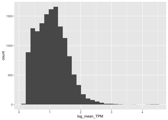
Cool!
Once we have the basic elements of our plot in place, we can begin to modify the finer details of it. Let's do that now
to demonstrate. For example, we can specify how the X and Y axis should be labelled by adding (+) an X label (xlab())
and a Y label (ylab()) as two additional layers. We can also use this syntax to add a title at the top of our graph
(ggtitle()):
(
  ggplot( mean_expression, aes( x = log_mean_TPM ))
  + geom_histogram()
  + xlab( "Mean expression (log-TPM)" )
  + ylab( "Number of genes" )
  + ggtitle( "Gene expression distribution in GTEx")
)
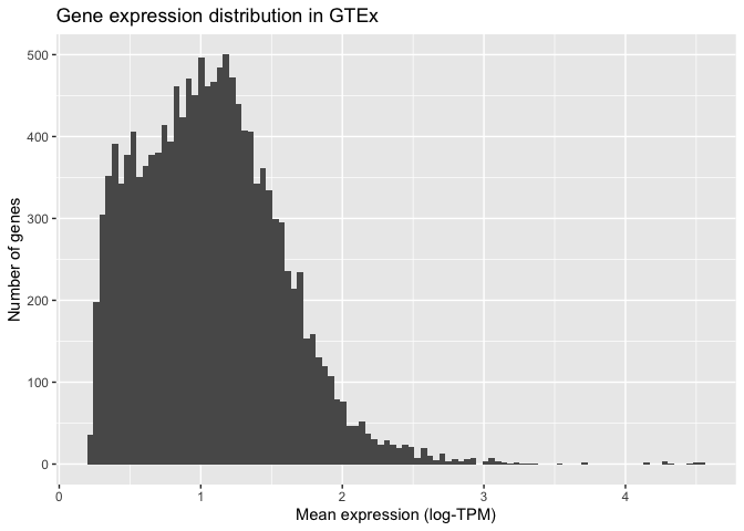
ggplot also allows us to specify how the histogram should be plotted. For instance, we can increase the number of bars shown to 100:
(
  ggplot( mean_expression, aes( x = log_mean_TPM ))
  + geom_histogram( bins = 100 )
  + xlab( "Mean expression (log-TPM)" )
  + ylab( "Number of genes" )
  + ggtitle("Gene expression distribution in GTEx" )
)
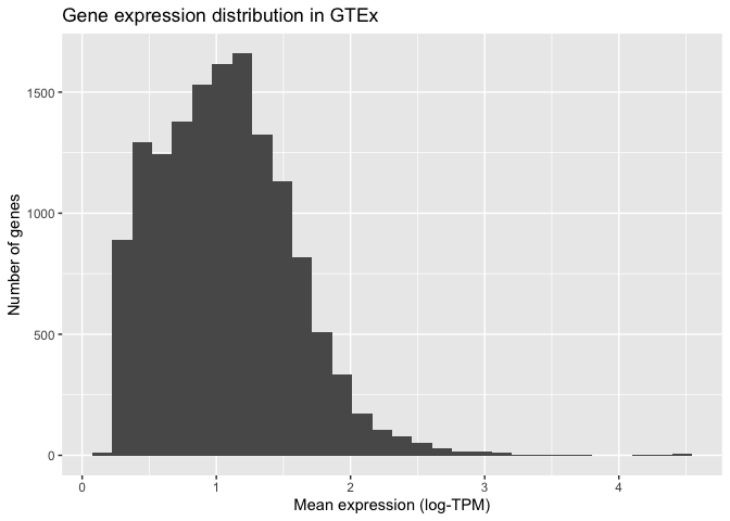
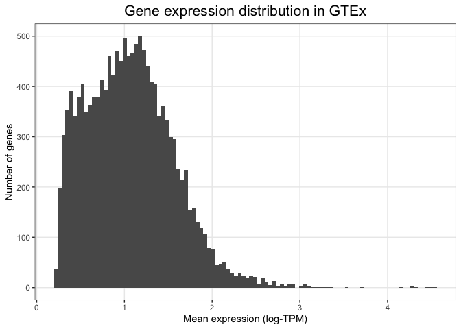
Finally, we can modify the visual elements of our plot - the theme - such as backgrounds, colours, text sizes, text alignments, etc... to our liking. We do this by specifying a theme and thematic elements. For example, by using theme_bw() we are telling ggplot to use a theme with a white background instead of the default grey backround:
(
  ggplot( mean_expression, aes( x = log_mean_TPM ) )
  + geom_histogram( bins = 100 )
  + xlab( "Mean expression (log-TPM)" )
  + ylab( "Number of genes" )
  + ggtitle( "Gene expression distribution in GTEx" )
  + theme_bw()
)

Other more detailed characteristics can also be changed inside the theme() function. For example, we can align the
title to the centre of the plot or reduce the number of lines shown in the plot grid:
(
  ggplot( mean_expression, aes( x = log_mean_TPM ) )
  + geom_histogram( bins = 100 )
  + xlab( "Mean expression (log-TPM)" )
  + ylab( "Number of genes" )
  + ggtitle( "Gene expression distribution in GTEx" )
  + theme_bw()
  + theme(
    plot.title =  element_text(hjust=0.5, size=16),
    panel.grid.minor = element_blank(),
    axis.title.y = element_text( angle = 0, vjust = 0.5 )
  )
)
By adding one layer at a time and specifying individual visual elements, ggplot allows us to create custom made plots that fulfill all our visual needs.
Have we histogrammed TPM on a log scale? No, technically we haven't. Instead, we've histogrammed is .
To histogram TPM instead, we should use the grammar of graphics to replace the x axis scale with a log scale. Like this:
(
  ggplot( mean_expression, aes( x = mean_TPM ) )
  + geom_histogram( bins = 100 )
  + xlab( "Mean expression (TPM)" )
  + scale_x_log10()
  + ylab( "Number of genes" )
  + ggtitle( "Gene expression distribution in GTEx" )
  + theme_bw()
  + theme(
    plot.title =  element_text(hjust=0.5, size=16),
    panel.grid.minor = element_blank(),
    axis.title.y = element_text( angle = 0, vjust = 0.5 )
  )
)
Can you see the difference between these last two plots?
This illustrates an important point: by changing scales, we can visualise variables 'as is' but altering the
visualisation scale as appropriate. Which one of these plots you like best will depend on whether you prefer thinking
of TPM or log TPM as the best measure of expression.